✅ Now Live: Advanced Order Store for All Business Types – Rentals, Services, Subscriptions & More!✅ Now Live: Advanced Order Store for All Business Types – Rentals, Services, Subscriptions & More!✅ Now Live: Advanced Order Store for All Business Types – Rentals, Services, Subscriptions & More!✅ Now Live: Advanced Order Store for All Business Types – Rentals, Services, Subscriptions & More!✅ Now Live: Advanced Order Store for All Business Types – Rentals, Services, Subscriptions & More!✅ Now Live: Advanced Order Store for All Business Types – Rentals, Services, Subscriptions & More!✅ Now Live: Advanced Order Store for All Business Types – Rentals, Services, Subscriptions & More!✅ Now Live: Advanced Order Store for All Business Types – Rentals, Services, Subscriptions & More!✅ Now Live: Advanced Order Store for All Business Types – Rentals, Services, Subscriptions & More!✅ Now Live: Advanced Order Store for All Business Types – Rentals, Services, Subscriptions & More!
Flex Align Mastery
This lesson focuses on the Flex Align design pattern, using CSS Flexbox for adaptable layouts and alignment. We'll learn to harness Flexbox for responsive design, ensuring seamless user experiences across devices.
The "Flex Align Mastery" design pattern harnesses the capabilities of CSS Flexbox alignment and direction to craft flexible and responsive layouts, ensuring content looks stunning across various screen sizes and devices. Flexbox, as a layout model, empowers designers to create intricate layout structures with streamlined and adaptable code.
- Efficient Alignment: Flexbox provides properties for aligning items vertically and horizontally with minimal effort. You can easily center content, align items to one side, or space them out evenly.
- Direction: Unlike traditional layout models, Flexbox doesn't require you to specify the layout direction (row or column) ahead of time. This means you can dynamically change the direction based on screen size or content type.
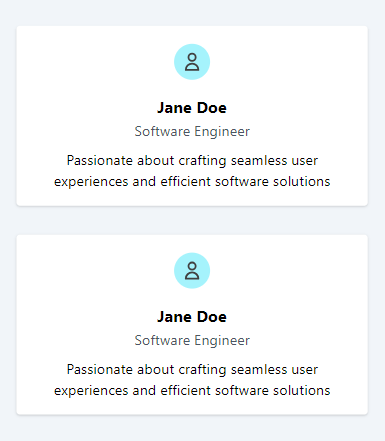
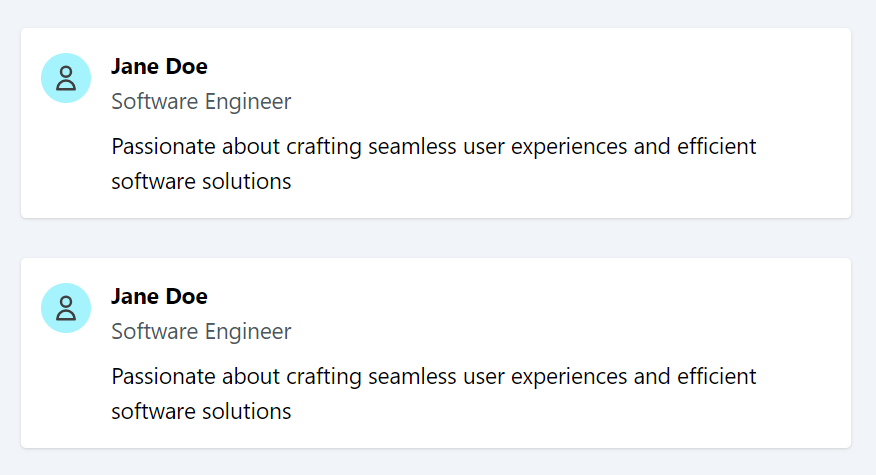
Example: User profile card showcasing alignment classes and flex direction
Create a responsive user profile card that adjusts its alignment and layout, transitioning from a vertical (column) arrangement on mobile devices to a horizontal (row) arrangement on desktops.
Mobile Design
Desktop Design
Code Snippet
<div className="my-8 bg-white p-4 rounded shadow"> <div className="flex flex-col gap-4 items-center md:items-start md:flex-row"> <div className=""> <div className='rounded-full size-10 bg-cyan-200 text-neutral-700 mt-1'> <svg className='p-2' fill="none" viewBox="0 0 24 24" stroke="currentColor"> <path strokeLinecap="round" strokeLinejoin="round" strokeWidth={2} d="M16 7a4 4 0 11-8 0 4 4 0 018 0zM12 14a7 7 0 00-7 7h14a7 7 0 00-7-7z" /> </svg> </div> </div> <div className="text-center md:text-left"> <div> <h2 className="text-lg font-bold">Jane Doe</h2> <p className="text-gray-600">Software Engineer</p> </div> <div className="mt-2"> <p>Passionate about crafting seamless user experiences and efficient software solutions</p> </div> </div> </div> </div>Code Explanation:
Responsive Flex Container:
The <div> with classes flex flex-col gap-4 items-center serves as the flex container. The first <div> inside the flex container holds the SVG avatar, while the second <div> contains the user's name, role, and a brief description. This arrangement ensures vertical alignment of the user avatar and text elements.
Additionally, we apply the md:items-start and md:flex-row classes to horizontally align the user avatar and text elements on medium-sized screens.
Responsive Alignment:
Content is centrally aligned on mobile devices. On medium screens and larger (md: breakpoint), the md:text-left class aligns the content to the left.
Conclusion:
The "Flex Align Mastery" design pattern showcases the strength and versatility of Flexbox, a tool essential for modern web design. By leveraging Flexbox, designers and developers gain unparalleled control over alignment, spacing, and direction of web elements, enabling the creation of responsive, adaptive layouts that cater to the diverse array of devices and screen sizes today's users employ.
This adaptability not only enhances the user experience but also streamlines the development process, reducing the need for redundant code and complex layout logic.
In this lesson, we will explore the Touch Point Dynamics design pattern, focusing on optimizing interactive elements for touch-based navigation. We'll cover techniques for designing accessible, responsive touch points that enhance user experience on touch-screen devices, ensuring smooth and intuitive interactions.
All Modules