✅ Now Live: Advanced Order Store for All Business Types – Rentals, Services, Subscriptions & More!✅ Now Live: Advanced Order Store for All Business Types – Rentals, Services, Subscriptions & More!✅ Now Live: Advanced Order Store for All Business Types – Rentals, Services, Subscriptions & More!✅ Now Live: Advanced Order Store for All Business Types – Rentals, Services, Subscriptions & More!✅ Now Live: Advanced Order Store for All Business Types – Rentals, Services, Subscriptions & More!✅ Now Live: Advanced Order Store for All Business Types – Rentals, Services, Subscriptions & More!✅ Now Live: Advanced Order Store for All Business Types – Rentals, Services, Subscriptions & More!✅ Now Live: Advanced Order Store for All Business Types – Rentals, Services, Subscriptions & More!✅ Now Live: Advanced Order Store for All Business Types – Rentals, Services, Subscriptions & More!✅ Now Live: Advanced Order Store for All Business Types – Rentals, Services, Subscriptions & More!
Touch Point Dynamics
In this lesson, we will explore the Touch Point Dynamics design pattern, focusing on optimizing interactive elements for touch-based navigation. We'll cover techniques for designing accessible, responsive touch points that enhance user experience on touch-screen devices, ensuring smooth and intuitive interactions.
The "Touch Point Dynamics" design pattern addresses the need for user interfaces to cater to diverse interaction modes, specifically distinguishing between mouse-driven inputs on desktops and touch gestures on mobile devices. Recognizing these fundamental interaction variances is key to elevating the overall user experience. Desktop environments favor the precision of cursor-based actions, while mobile platforms thrive on direct touch interactions, including taps, swipes, and pinches.
Key Considerations:
- Larger Touch Targets: Mobile interfaces are designed with larger, finger-friendly touch targets, contrasting with the pinpoint accuracy afforded by mouse clicks.
- Gesture Controls: Tailored gesture controls enhance mobile usability, introducing actions like swipe-to-delete or pull-to-refresh, which have no direct desktop counterparts.
- Hover States: Desktop UIs can leverage hover states for additional interaction layers, a feature absent in touch-centric designs that necessitates alternative approaches.
Requirement
The objective is to implement a responsive card layout that adapts between a swipeable horizontal scroll on touch devices and a more traditional grid display on desktops. This flexible approach is ideal for showcasing a variety of content types, including movies, product listings, or promotional materials.
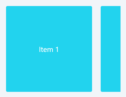
Mobile
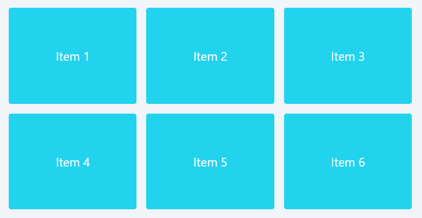
Desktop
Code Snippet
<div className="flex overflow-x-auto scroll-smooth whitespace-nowrap gap-6 md:grid md:grid-cols-3 md:gap-4"> {items.map((item) => ( <div key={item} className="w-3/4 md:w-full aspect-w-4 aspect-h-3 flex-shrink-0 bg-cyan-400 rounded"> <div className=" flex items-center justify-center text-white text-xl"> {`Item ${item}`} </div> </div> ))} </div>Implementation Details
Responsive Layout: Utilizing Tailwind CSS's responsive utilities, this design transitions from an intuitive horizontal scroll for touch inputs to a structured grid for mouse-based navigation, optimizing for device-specific interaction styles.
Smooth Scrolling: The scroll-smooth utility enhances the browsing experience on touch devices, making content exploration seamless and intuitive.
Accessibility and Usability: This design prioritizes cross-device usability, ensuring that all users, regardless of their preferred interaction mode, enjoy a cohesive and engaging experience.
Conclusion:
The "Touch Point Dynamics" design pattern underscores the importance of designing for the nuances of touch and mouse interactions, ensuring that digital experiences are accessible, intuitive, and enjoyable across all devices. By thoughtfully applying this pattern, developers and designers can create interfaces that not only meet but exceed user expectations, making every interaction a delight. This responsive card layout exemplifies how to apply these principles in practice, offering a versatile solution that adapts seamlessly to the user's device and mode of interaction.
This lesson examines the Content-Unfold responsive design pattern, aimed at progressively revealing content to boost user interaction. We'll discuss how to implement this approach for a seamless, engaging experience on any device.
All Modules