✅ Now Live: Advanced Order Store for All Business Types – Rentals, Services, Subscriptions & More!✅ Now Live: Advanced Order Store for All Business Types – Rentals, Services, Subscriptions & More!✅ Now Live: Advanced Order Store for All Business Types – Rentals, Services, Subscriptions & More!✅ Now Live: Advanced Order Store for All Business Types – Rentals, Services, Subscriptions & More!✅ Now Live: Advanced Order Store for All Business Types – Rentals, Services, Subscriptions & More!✅ Now Live: Advanced Order Store for All Business Types – Rentals, Services, Subscriptions & More!✅ Now Live: Advanced Order Store for All Business Types – Rentals, Services, Subscriptions & More!✅ Now Live: Advanced Order Store for All Business Types – Rentals, Services, Subscriptions & More!✅ Now Live: Advanced Order Store for All Business Types – Rentals, Services, Subscriptions & More!✅ Now Live: Advanced Order Store for All Business Types – Rentals, Services, Subscriptions & More!
SeeHide Tactics Pattern
In this lesson, we'll explore the See-Hide responsive design pattern, focusing on optimizing content visibility across devices. We'll discuss how to strategically show or hide elements to improve user experience and interface clarity.
Dynamically Showing and Hiding Elements
SeeHide Tactics is a design pattern focused on improving the user interface (UI) and user experience (UX) by dynamically showing or hiding elements based on screen sizes and user interactions. This approach is essential in responsive web design, where the goal is to provide an optimal viewing experience across a wide range of devices, from mobile phones to desktop monitors.
How It Works
Using Tailwind CSS, you can implement the "SeeHide" design tactic by applying utility classes that control the visibility of elements based on screen sizes or other conditions.
- Screen Size-Based Visibility: You can use Tailwind CSS classes like lg:hidden and md:block to hide or show elements on specific screen sizes. For example, lg:hidden will hide an element on large screens, while md:block will make it visible on medium-sized screens.
- Conditional Visibility: You can also use Tailwind CSS classes like hidden and block along with JavaScript or other logic to conditionally show or hide elements based on user interactions or data conditions.
Requirement - A Responsive Job Listings Page
Develop a Job Listings Page that delivers an optimal user experience across various devices. Desktop users will experience a comprehensive view with filter options on the left side, while mobile users will access filters through a toggleable menu, ensuring a clutter-free and user-centric interface.
Approach:
We adopt a mobile-first development strategy, initially focusing on the mobile layout and subsequently enhancing the design for larger screens. This approach underscores the principle of progressive enhancement, ensuring our application is accessible and functional across all devices.
Step 1: Displaying Job Listings
Initially, we render the job listings within our React component. This data, fetched from an API, is dynamically displayed in a mobile-friendly layout.
Code Snippet
<div className="flex flex-col"> {/* Job Listings */} <div className="flex flex-col gap-2 bg-white"> {jobs.map(job => ( <div key={job.id} className="p-4 m-2 border border-gray-200 rounded"> <h5 className="font-bold">{job.title}</h5> <div>{job.location} - {job.type}</div> <span className="text-sm text-gray-600">{job.category}</span> </div> ))} </div> </div>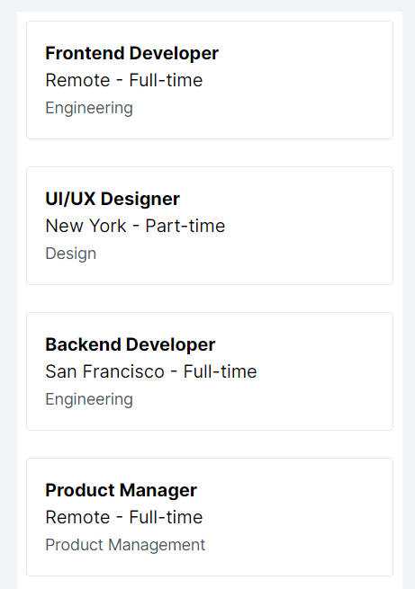
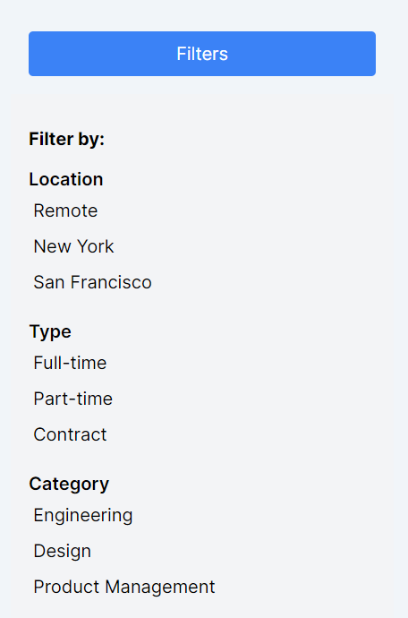
Step 2: Introducing Filter Options for Mobile
Next, we introduce a button that, when clicked, reveals various filter options. This ensures that mobile users have access to the same powerful filtering capabilities without overwhelming the interface.
Code Snippet
<div className="flex flex-col"> <button onClick={() => setIsFiltersOpen(!isFiltersOpen)} className="bg-blue-500 text-white p-2 rounded m-4"> Filters </button> {/* Filters Panel */} <div className={`${isFiltersOpen ? "block" : "hidden"} bg-gray-100 p-4 w-full md:w-1/4`}> <h3 className="font-bold my-3">Filter by:</h3> {/* Location Filter */} <div className='flex flex-col gap-4'> <div> <h4 className="font-semibold">Location</h4> {filters.location.map(location => <button key={location} className="block text-left p-1">{location}</button>)} </div> {/* Type Filter */} <div> <h4 className="font-semibold">Type</h4> {filters.type.map(type => <button key={type} className="block text-left p-1">{type}</button>)} </div> {/* Category Filter */} <div> <h4 className="font-semibold">Category</h4> {filters.category.map(category => <button key={category} className="block text-left p-1">{category}</button>)} </div> </div> </div> {/* Job Listings */} <div className="flex flex-col gap-2 bg-white"> {jobs.map(job => ( <div key={job.id} className="p-4 m-2 border border-gray-200 rounded"> <h5 className="font-bold">{job.title}</h5> <p>{job.location} - {job.type}</p> <span className="text-sm text-gray-600">{job.category}</span> </div> ))} </div> </div>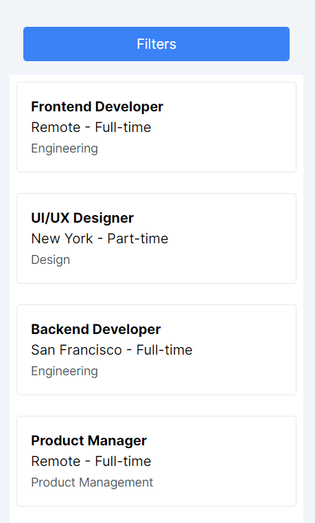
Step 3: Adapting Design for Larger Screens
Finally, we adapt our layout for larger screens by implementing the following changes:
- Layout Adjustment: We transition the parent container to a row layout on wider screens using md:flex-row, placing filters and job listings side by side.
- Filter Visibility: The filter button is hidden (md:hidden) on larger screens since the filter panel is always visible, ensuring seamless access to filter options.
- Responsive Filter Panel: The filter panel remains visible on all screens with md:block, catering to the desktop layout's needs.
- Job Listings Width: We allocate 3/4 of the screen width to job listings (md:w-3/4) on larger screens, balancing the space between filters and listings effectively.
Code Snippet
<div className="flex flex-col md:flex-row"> <button onClick={() => setIsFiltersOpen(!isFiltersOpen)} className="md:hidden bg-blue-500 text-white p-2 rounded m-4"> Filters </button> {/* Filters Panel */} <div className={`${isFiltersOpen ? "block" : "hidden"} md:block bg-gray-100 p-4 w-full md:w-1/4`}> <h3 className="font-bold my-3">Filter by:</h3> {/* Location Filter */} <div className='flex flex-col gap-4'> <div> <h4 className="font-semibold">Location</h4> {filters.location.map(location => <button key={location} className="block text-left p-1">{location}</button>)} </div> {/* Type Filter */} <div> <h4 className="font-semibold">Type</h4> {filters.type.map(type => <button key={type} className="block text-left p-1">{type}</button>)} </div> {/* Category Filter */} <div> <h4 className="font-semibold">Category</h4> {filters.category.map(category => <button key={category} className="block text-left p-1">{category}</button>)} </div> </div> </div> {/* Job Listings */} <div className="flex flex-col gap-2 bg-white md:w-3/4"> {jobs.map(job => ( <div key={job.id} className="p-4 m-2 border border-gray-200 rounded"> <h5 className="font-bold">{job.title}</h5> <p>{job.location} - {job.type}</p> <span className="text-sm text-gray-600">{job.category}</span> </div> ))} </div> </div>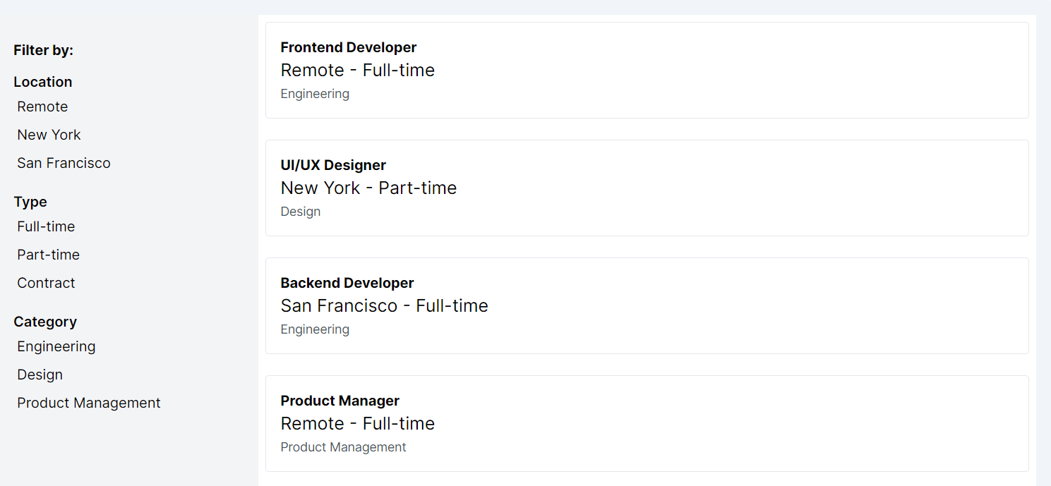
Conclusion
By starting with a mobile-first approach and progressively enhancing our design for larger screens, we ensure our Job Listings Page is both functional and appealing across all devices. This seehide pattern, coupled with the dynamic display of content in React and the styling capabilities of Tailwind CSS, allows us to create an efficient, accessible, and engaging user experience.
This lesson focuses on the Flex Align design pattern, using CSS Flexbox for adaptable layouts and alignment. We'll learn to harness Flexbox for responsive design, ensuring seamless user experiences across devices.
All Modules