✅ Now Live: Advanced Order Store for All Business Types – Rentals, Services, Subscriptions & More!✅ Now Live: Advanced Order Store for All Business Types – Rentals, Services, Subscriptions & More!✅ Now Live: Advanced Order Store for All Business Types – Rentals, Services, Subscriptions & More!✅ Now Live: Advanced Order Store for All Business Types – Rentals, Services, Subscriptions & More!✅ Now Live: Advanced Order Store for All Business Types – Rentals, Services, Subscriptions & More!✅ Now Live: Advanced Order Store for All Business Types – Rentals, Services, Subscriptions & More!✅ Now Live: Advanced Order Store for All Business Types – Rentals, Services, Subscriptions & More!✅ Now Live: Advanced Order Store for All Business Types – Rentals, Services, Subscriptions & More!✅ Now Live: Advanced Order Store for All Business Types – Rentals, Services, Subscriptions & More!✅ Now Live: Advanced Order Store for All Business Types – Rentals, Services, Subscriptions & More!
Ratio Locks
In this lesson, we will delve into the Ratio Lock responsive design pattern, concentrating on maintaining consistent aspect ratios of elements across different screen sizes to preserve design integrity and user experience.
The "Ratio Locks" UI design pattern refers to techniques used to maintain the aspect ratio of embedded content across different screen sizes and resolutions, ensuring that such content preserves its visual integrity and appearance. This pattern is crucial for a wide range of embedded content, including images, videos, iframes, and responsive containers that need to scale while keeping their height and width in proportion.
Importance of Maintaining Aspect Ratios
- Consistency Across Devices: As users access web content from various devices (smartphones, tablets, laptops, etc.), maintaining the aspect ratio ensures that embedded content looks consistent and undistorted.
- Visual Integrity: Correct aspect ratios ensure that images and videos do not appear stretched or squished, preserving the original visual intent.
- Responsive Design: Part of creating a responsive design involves ensuring that content scales appropriately for different screen sizes without losing its aspect ratio.
Tailwind CSS provides a straightforward and efficient way to implement the "Ratio Locks" design pattern, especially with its support for aspect ratio utilities in recent versions. These utilities make it easy to maintain the aspect ratio of embedded content like images, videos, and iframes, ensuring they scale responsively while preserving their original proportions.
1. Embedding YouTube Video
Incorporating a YouTube video into your website with a responsive design requires thoughtful implementation to ensure it adapts across various devices while maintaining its aspect ratio. The goal is to preserve the video's visual integrity without distortion, regardless of the viewer's screen size.
Tailwind CSS, with its utility-first approach, provides a straightforward solution to achieve this. Here’s an elaborative guide on how to embed a YouTube video within an iframe while locking it to a 16:9 aspect ratio using Tailwind CSS.
Step 1: HTML Structure for Embedded YouTube Video
The foundational step involves crafting the HTML structure to embed your YouTube video. The <iframe> tag is used for embedding external content, such as videos, within your webpage. Here's how you would typically set it up for a YouTube video:
Code Snippet
<iframe src="https://www.youtube.com/embed/dpXBV3COwJM?si=1t7jzRq6qTYxFhAR" allowFullScreen></iframe>Step 2: Utilizing Tailwind CSS for Responsive Aspect Ratio
Now we will use two classes from Tailwind CSS to ensure the video maintains a responsive design and the desired aspect ratio.
- aspect-video: This class is specifically designed to maintain a 16:9 aspect ratio, which is a common format for videos. It ensures that as the viewport width changes, the height of the video adjusts accordingly to preserve the 16:9 ratio, preventing any distortion.
- w-full: This class ensures the iframe takes up the full width of its containing element, allowing it to be responsive and adapt to different screen widths.
Code Snippet
<iframe className='aspect-video w-full' src="https://www.youtube.com/embed/dpXBV3COwJM?si=1t7jzRq6qTYxFhAR" allowFullScreen></iframe>Tailwind CSS provides a set of predefined classes for common aspect ratios, enhancing the ease of embedding responsive content:
- aspect-square: For content that needs to maintain a 1:1 aspect ratio, making it perfectly square.
- aspect-video: Tailored for videos, this class locks the aspect ratio to 16:9, ideal for YouTube videos and other widescreen media content.
- aspect-auto: This class sets the aspect ratio based on the actual content, allowing it to adjust dynamically.
2. Extending Aspect Ratios with Tailwind CSS Plugin
If your design requires aspect ratios beyond the predefined options, Tailwind CSS's aspect ratio plugin allows for customization. Here's a guide on extending your project with additional aspect ratios.
Step 1: Install the Plugin via npm
First, you need to install the Aspect Ratio plugin through npm (Node Package Manager). Open your terminal or command prompt and navigate to your project's root directory. Then run the following command:
Code Snippet
npm install -D @tailwindcss/aspect-ratioThis command installs the Aspect Ratio plugin as a development dependency in your project.
Step 2: Configure Your Tailwind CSS Setup
After installing the plugin, you'll need to integrate it into your Tailwind CSS configuration. This process involves editing your tailwind.config.js file, typically located at the root of your project.
Integrating with Tailwind CSS Configuration
To use the plugin's extended classes alongside Tailwind CSS v3.0's default aspect ratio utilities, you need to configure your tailwind.config.js file:
1. Open tailwind.config.js: Locate and open your tailwind.config.js file in a text editor.
2. Disable the Native Aspect Ratio Utility: Tailwind CSS v3.0 includes native aspect ratio utilities that might conflict with the plugin. To avoid these conflicts, disable the native aspect ratio utility by setting aspectRatio to false under corePlugins. Here's how you do it:
Code Snippet
// tailwind.config.jsconst config: Config = { corePlugins:{ aspectRatio:false }, ....}3. Add the Plugin: In the same configuration file, include the Aspect Ratio plugin within the plugins array. This step activates the plugin in your Tailwind CSS environment. Here's the code snippet for it:
Code Snippet
// tailwind.config.jsmodule.exports = { // Existing configuration... plugins: [ require('@tailwindcss/aspect-ratio'), // ... other plugins ],}Step 3: Verify Configuration
After editing the configuration file, it's a good practice to ensure that your project builds successfully. Run your build process and check for any configuration errors.
Step 4: Start Using the Plugin
With the plugin installed and configured, you can now use the extended aspect ratio classes in your HTML and Tailwind CSS files. For example, to create a container with a 16:9 aspect ratio, you would use classes like aspect-w-16 and aspect-h-9.
Code Snippet
<div className="aspect-w-16 aspect-h-9"> <iframe src="https://www.youtube.com/embed/dpXBV3COwJM?si=1t7jzRq6qTYxFhAR" allowFullScreen></iframe></div>3. Responsive Image Sizing: Using Intrinsic Width and Height
In web design, when you're creating a responsive layout and you're not entirely certain about the aspect ratio you want for an image, it's essential to ensure that the image covers the available space within its container. To achieve this, one effective approach is to specify the width and height properties of the image equal to its intrinsic width and height.
Here's how it works:
- Setting Intrinsic Width and Height: By setting the width and height properties of the image to be the same as its intrinsic width and height (the actual pixel dimensions of the image), you allow the browser to calculate the image's aspect ratio automatically.
- Taking Up Available Space: With the width set to 100%, the image will expand to fill the entire width of its container, making it responsive to different screen sizes.
- Automatic Aspect Ratio Calculation: When you set both the width and height based on the intrinsic dimensions, the browser will automatically calculate the height that maintains the image's original aspect ratio.
- Ensuring Proper Scaling: This approach ensures that the image scales proportionally to cover the available space while preserving its original aspect ratio. This helps in preventing distortion and maintaining image quality.
- Avoiding Layout Shifts: Another significant advantage of specifying the width and height properties of an image equal to its intrinsic width and height is that it helps prevent layout shifts during page loading. Without these values defined, images may load and adjust their size, causing unexpected and distracting layout shifts for users. By setting the dimensions upfront, you ensure that the space for the image is reserved from the beginning, eliminating any jarring shifts in the page layout as images load. This contributes to a smoother and more user-friendly browsing experience.
Example:
If you are creating a grid structure and want to add an image, specify the intrinsic width and height of the image as mentioned below to prevent layout shifts.
Thanks to the CSS applied in Tailwind preflight classes, the image automatically covers the entire available space, and the browser automatically calculates the appropriate height to be displayed based on the aspect ratio.
Code Snippet
<div className="grid grid-cols-3 gap-10 bg-white "> <div className='col-span-1'> <img className="rounded" src="b2-image.webp" width={600} height={400} alt="Large Width Image" /> </div> <div className='self-center col-span-2'> <div className='text-2xl'>Good design is obvious. Great design is transparent.</div> </div> </div>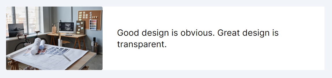
The following CSS is automatically applied by the Tailwind Preflight classes:
Code Snippet
Conclusion:
Locking the aspect ratio of videos and images is a fundamental practice in modern web design, crucial for ensuring that multimedia content is displayed correctly across diverse devices and screen sizes. Through the use of Tailwind CSS's aspect ratio utilities and the ability to define custom ratios, web developers and designers are equipped to create responsive, visually appealing, and user-friendly web experiences.
This lesson underscores the importance of aspect ratio maintenance as a cornerstone of responsive design, empowering us to build websites that look and function beautifully, no matter where or how they are accessed.
This lesson covers the Table Flow design pattern, which addresses strategies for displaying tabular data responsively across various devices. We will discuss methods to ensure tables adapt smoothly to different screen widths, optimizing readability and interaction by adjusting column visibility, resizing, or reformatting content for mobile and desktop views.
All Modules