✅ Now Live: Advanced Order Store for All Business Types – Rentals, Services, Subscriptions & More!✅ Now Live: Advanced Order Store for All Business Types – Rentals, Services, Subscriptions & More!✅ Now Live: Advanced Order Store for All Business Types – Rentals, Services, Subscriptions & More!✅ Now Live: Advanced Order Store for All Business Types – Rentals, Services, Subscriptions & More!✅ Now Live: Advanced Order Store for All Business Types – Rentals, Services, Subscriptions & More!✅ Now Live: Advanced Order Store for All Business Types – Rentals, Services, Subscriptions & More!✅ Now Live: Advanced Order Store for All Business Types – Rentals, Services, Subscriptions & More!✅ Now Live: Advanced Order Store for All Business Types – Rentals, Services, Subscriptions & More!✅ Now Live: Advanced Order Store for All Business Types – Rentals, Services, Subscriptions & More!✅ Now Live: Advanced Order Store for All Business Types – Rentals, Services, Subscriptions & More!
Space Crafting
In this lesson, we will explore the Space Crafting responsive design pattern, which focuses on optimizing the use of available space in user interfaces across various screen sizes and resolutions. We will learn how padding and margins can be adjusted dynamically for different devices to ensure a cohesive and accessible user experience.
Enhancing Readability and Design Flow with Tailwind CSS
Space Crafting is a design pattern that emphasizes the strategic manipulation of spacing within a user interface (UI) to improve readability and the overall flow of design across various screen sizes. This pattern plays a critical role in responsive web design, ensuring that content is not only accessible but also aesthetically pleasing and easy to navigate, regardless of the device being used.
Tailwind CSS and Space Crafting
Tailwind CSS offers a comprehensive set of spacing utilities that can be employed to implement the Space Crafting design pattern effectively. These utilities allow for the precise adjustment of margins, padding, gap, and space between elements, facilitating a responsive design that adapts seamlessly across devices.
How It Works
Utility Classes: Tailwind CSS provides a range of utility classes for margin (m-, mt-, mr-, mb-, ml-), padding (p-, pt-, pr-, pb-, pl-), and gap (gap-). Each utility is available in a spectrum of sizes (e.g., m-1, p-2, gap-4) and can be applied responsively using prefix breakpoints (sm:, md:, lg:, xl:, 2xl:).
Responsive Spacing: By leveraging these utility classes with responsive prefixes, you can tailor spacing for different screen sizes, enhancing the user experience. For instance, sm:p-4 lg:p-8 applies more padding on larger screens while maintaining a compact layout on smaller devices.
Requirement: Blog Page
We aim to design a responsive blog page that showcases a list of articles. The key objectives for employing the Space Crafting design pattern are as follows:
- Optimal Readability: Ensure that the text and elements are neither too cramped nor too spread out, adapting spacings like margins and paddings for different screen sizes to enhance readability.
- Visual Appeal: Maintain a visually appealing layout that gracefully transitions across devices, using spacing to guide the user's eye through content.
- User-Friendly Navigation: Create a layout that facilitates easy navigation, allowing users to comfortably interact with the content regardless of their device.
Approach
Adopting a mobile-first strategy, we start by designing for the smallest screens, progressively adding responsive adjustments for larger screens using Tailwind CSS's utilities.
Step 1: Mobile Layout
First, we set up the basic structure for our blog page, focusing on a single-column layout that suits mobile screens.
- Padding for the Container: p-4 ensures there is padding around the content, preventing it from touching the screen edges.
- Margin Between Articles: mb-6 separates each article, making the list easier to scan.
Code Snippet
<div className="p-4"> {articles.map((article) => ( <div key={article.id} className="mb-6"> <h2 className="text-xl font-bold mb-2">{article.title}</h2> <p className="text-gray-700 text-base">{article.excerpt}</p> </div> ))} </div>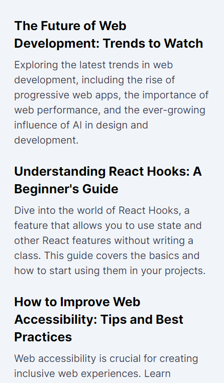
Step 2: Enhancing Spacing for Larger Screens
Next, we introduce responsive spacing adjustments to better utilize the available screen real estate on tablets and desktops, improving the layout's flow and readability.
- Responsive Padding: md:p-8 increases the padding around the container on medium-sized screens and above, offering more breathing space.
- Increased Margin and Text Size: With md:mb-8, md:text-2xl, and md:text-lg, we adjust the spacing between articles and increase text sizes to improve legibility and aesthetic appeal on larger screens.
Code Snippet
<div className="p-4 md:p-8"> {articles.map((article) => ( <div key={article.id} className="mb-6 md:mb-8"> <h2 className="text-xl md:text-2xl font-bold mb-2 md:mb-4">{article.title}</h2> <p className="text-gray-700 text-base md:text-lg">{article.excerpt}</p> </div> ))} </div>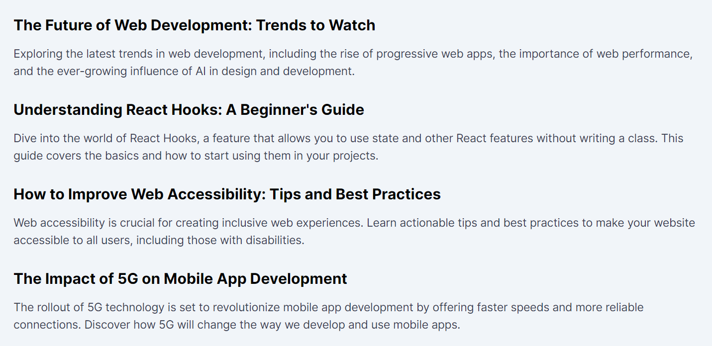
Conclusion
By meticulously applying the Space Crafting design pattern through Tailwind CSS's responsive utilities, we've developed a blog page layout that maintains optimal readability and visual appeal across devices. Starting with a mobile-first approach ensures that the design is accessible and user-friendly from the smallest device, with spacing adjustments enhancing the experience as screen sizes increase. This methodical approach to spacing embodies the essence of Space Crafting, showcasing how strategic adjustments can significantly elevate the user experience in responsive web design.
In this lesson, we will delve into the Ratio Lock responsive design pattern, concentrating on maintaining consistent aspect ratios of elements across different screen sizes to preserve design integrity and user experience.
All Modules