✅ Now Live: Advanced Order Store for All Business Types – Rentals, Services, Subscriptions & More!✅ Now Live: Advanced Order Store for All Business Types – Rentals, Services, Subscriptions & More!✅ Now Live: Advanced Order Store for All Business Types – Rentals, Services, Subscriptions & More!✅ Now Live: Advanced Order Store for All Business Types – Rentals, Services, Subscriptions & More!✅ Now Live: Advanced Order Store for All Business Types – Rentals, Services, Subscriptions & More!✅ Now Live: Advanced Order Store for All Business Types – Rentals, Services, Subscriptions & More!✅ Now Live: Advanced Order Store for All Business Types – Rentals, Services, Subscriptions & More!✅ Now Live: Advanced Order Store for All Business Types – Rentals, Services, Subscriptions & More!✅ Now Live: Advanced Order Store for All Business Types – Rentals, Services, Subscriptions & More!✅ Now Live: Advanced Order Store for All Business Types – Rentals, Services, Subscriptions & More!
Table Flow
This lesson covers the Table Flow design pattern, which addresses strategies for displaying tabular data responsively across various devices. We will discuss methods to ensure tables adapt smoothly to different screen widths, optimizing readability and interaction by adjusting column visibility, resizing, or reformatting content for mobile and desktop views.
Enhancing Responsiveness of Tables
The Table Flow design pattern is tailored for enhancing the accessibility and legibility of table data across various devices, with a special focus on overcoming the challenges associated with smaller screens.
Traditional HTML tables, due to their fixed width and inability to adapt to varying screen sizes, often pose usability issues on mobile devices. The Table Flow pattern mitigates these issues by employing responsive design techniques, ensuring tables remain both useful and readable, no matter the device.
How it works
To apply the Table Flow pattern effectively, leverage the following Tailwind CSS utilities:
- overflow-x-auto: This utility enables horizontal scrolling within a container, introducing a scrollbar when the content width surpasses the container's width, which is essential for viewing the entire table on narrow screens.
- min-w-full: Guarantees that the table extends to the full width of its container, facilitating better content visibility across all screen sizes.
Requirement
- The aim is to design a responsive sales report table showcasing columns for Date, Product Name, Quantity Sold, Unit Price, and Total Revenue.
- The table must retain its structural integrity across devices, incorporating horizontal scrolling on mobile devices to preserve full-width visibility without compromising on data clarity or necessitating an alternate layout.
Approach
Traditionally, a mobile-first design approach is advocated. However, given that tables historically predate responsive design principles, we initially craft the table with desktop displays in mind, subsequently adapting it for mobile screens through horizontal scrolling.
Step 1: Desktop Design
The first step in employing the TableFlow design pattern is to create a table layout optimized for desktop screens. This involves designing a table that is visually appealing, easy to read, and structured to display all necessary data without the constraints of narrow screen widths typical of mobile devices.
Code Snippet
<div> <table className="divide-y divide-gray-200"> <thead className="bg-gray-50"> <tr> <th className="px-6 py-3 text-left text-xs font-medium text-gray-500 uppercase tracking-wider">Date</th> <th className="px-6 py-3 text-left text-xs font-medium text-gray-500 uppercase tracking-wider">Product Name</th> <th className="px-6 py-3 text-left text-xs font-medium text-gray-500 uppercase tracking-wider">Quantity Sold</th> <th className="px-6 py-3 text-left text-xs font-medium text-gray-500 uppercase tracking-wider">Unit Price</th> <th className="px-6 py-3 text-left text-xs font-medium text-gray-500 uppercase tracking-wider">Total Revenue</th> </tr> </thead> <tbody className="bg-white divide-y divide-gray-200"> {salesData.map((item, index) => ( <tr key={index} className={index % 2 === 0 ? 'bg-gray-50' : 'bg-white'}> <td className="px-6 py-4 whitespace-nowrap">{item.date}</td> <td className="px-6 py-4 whitespace-nowrap">{item.productName}</td> <td className="px-6 py-4 whitespace-nowrap">{item.quantitySold}</td> <td className="px-6 py-4 whitespace-nowrap">{item.unitPrice}</td> <td className="px-6 py-4 whitespace-nowrap">{item.totalRevenue}</td> </tr> ))} </tbody> </table> </div>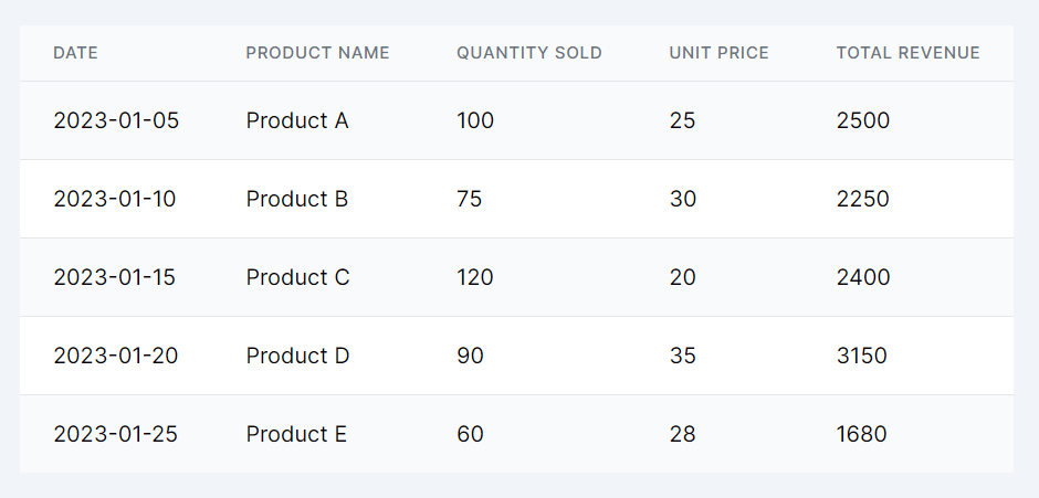
Step 2: Adapt for smaller devices - mobile
For mobile devices, the overflow-x-auto class is applied to enable horizontal scrolling for the wide table, while min-w-full ensures the table fully spans its container, allowing users to scroll through the entire table content without altering its inherent structure.
Code Snippet
<div className="overflow-x-auto"> <table className="min-w-full divide-y divide-gray-200"> {/* Table structure remains the same */} </table> </div>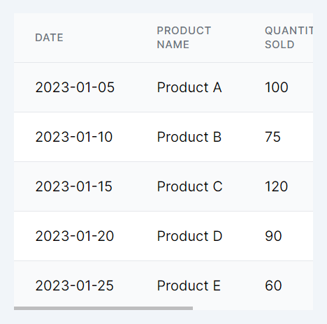
Conclusion
The Table Flow Design Pattern, especially when integrated with Tailwind CSS, offers a streamlined approach to maintaining the accessibility and readability of tables across all devices. By starting with a desktop-centric design and introducing responsive adjustments for mobile viewing, this pattern ensures that tables—a staple of data presentation—remain effective and user-friendly in the era of responsive web design.
This lesson explores the Canvas Slide Secret pattern, focusing on revealing hidden content or features in web and mobile apps through sliding. We'll discuss implementing this technique to enrich user experiences by enabling discovery and interactivity directly on the canvas.
All Modules