✅ Now Live: Advanced Order Store for All Business Types – Rentals, Services, Subscriptions & More!✅ Now Live: Advanced Order Store for All Business Types – Rentals, Services, Subscriptions & More!✅ Now Live: Advanced Order Store for All Business Types – Rentals, Services, Subscriptions & More!✅ Now Live: Advanced Order Store for All Business Types – Rentals, Services, Subscriptions & More!✅ Now Live: Advanced Order Store for All Business Types – Rentals, Services, Subscriptions & More!✅ Now Live: Advanced Order Store for All Business Types – Rentals, Services, Subscriptions & More!✅ Now Live: Advanced Order Store for All Business Types – Rentals, Services, Subscriptions & More!✅ Now Live: Advanced Order Store for All Business Types – Rentals, Services, Subscriptions & More!✅ Now Live: Advanced Order Store for All Business Types – Rentals, Services, Subscriptions & More!✅ Now Live: Advanced Order Store for All Business Types – Rentals, Services, Subscriptions & More!
Canvas Slide Secrets
This lesson explores the Canvas Slide Secret pattern, focusing on revealing hidden content or features in web and mobile apps through sliding. We'll discuss implementing this technique to enrich user experiences by enabling discovery and interactivity directly on the canvas.
The "Canvas Slide Secret" design pattern refers to a responsive design strategy where off-canvas elements—such as menus, sidebars, or additional content—are hidden off the screen and can slide in or be revealed upon a user's action.
This pattern is particularly useful in designing for mobile devices where screen real estate is limited, allowing designers to provide access to additional content or navigation without overcrowding the visible canvas.
- Off-Canvas Structure: Elements are positioned outside the visible viewport initially, usually to the left or right side of the screen.
- Trigger Mechanism: A user action, like clicking a button or swiping, triggers the slide-in effect, bringing the off-canvas element into view.
- Responsive Adaptation: While primarily used for mobile or smaller screens, the pattern can also enhance the user experience on larger displays by reducing clutter and focusing on content.
Canvas Slide Menu
The following component demonstrates the Canvas Slide Secrets pattern using Tailwind CSS and React state management. The sidebar's visibility is toggled through a boolean state (isSidebarOpen), controlled by onClick events on the hamburger menu and close button. This implementation showcases how to create an interactive, user-friendly navigation system that adapts to both desktop and mobile environments, maintaining accessibility and ease of use across devices.
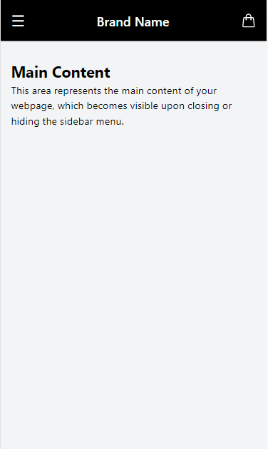
- At the top of the page, a flex container holds the hamburger menu icon, brand name, and shopping bag icon. The hamburger menu, when clicked, triggers the state change with setIsSidebarOpen(true), making the sidebar visible.
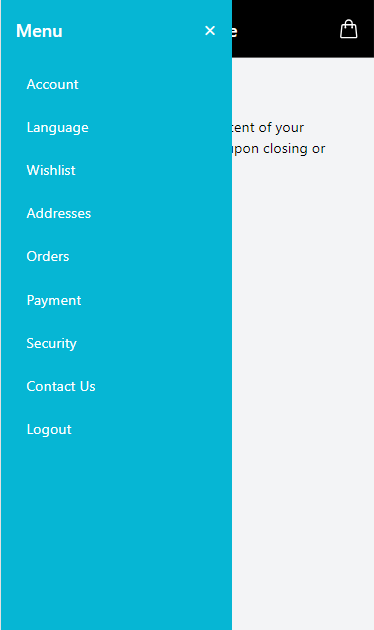
- The sidebar itself is a fixed element positioned at the left edge of the viewport. It stretches the full height of the viewport (inset-y-0 left-0), ensuring it's always accessible regardless of the user's scroll position on the page.
- Inside the sidebar, a close button (×) allows users to hide the sidebar, reversing the opening action by setting isSidebarOpen to false.
- Navigation links within the sidebar provide quick access to various sections of the application, styled with Tailwind CSS for consistency and enhanced user experience.
- The main content of the page is placed outside the sidebar, ensuring it remains accessible and visible when the sidebar is hidden. This content can include any relevant information or functionality pertinent to the application.
How It Works:
- The sidebar's appearance is controlled through CSS transformations and transitions, leveraging Tailwind CSS's utility classes.
- When the sidebar is not visible, the -translate-x-full class moves it completely out of the viewport, effectively hiding it from view.
- Upon clicking the hamburger menu icon, the sidebar's class changes to translate-x-0, bringing it into view by translating it back to its original position.
- The transition effect is achieved using the transition-transform class, combined with duration-300 and ease-in-out, which specifies the duration and easing function of the transition, creating a smooth sliding effect as the sidebar enters or exits the screen.
Code snippet
Code Snippet
<div className="relative min-h-screen bg-gray-100"> {/* Hamburger Menu and Brand Name */} <div className="flex justify-between items-center bg-black p-4 text-white"> <button onClick={() => setIsSidebarOpen(true)} className="text-2xl"> ? </button> <h2 className="text-xl font-semibold">Brand Name</h2> <button className=""> .... </button> </div> {/* Sidebar */} <div className={`fixed inset-y-0 left-0 transform ${isSidebarOpen ? 'translate-x-0' : '-translate-x-full'} transition-transform duration-300 ease-in-out bg-cyan-500 text-white w-64 p-4 space-y-6 z-10`}> {/* Close Button */} <div className="flex justify-between items-center"> <h2 className="text-xl font-semibold">Menu</h2> <button onClick={() => setIsSidebarOpen(false)} className="text-2xl">×</button> </div> {/* Sidebar navigation links */} <nav> {navLinks.map((link, index) => ( <a key={index} href={link.href} className="flex items-center gap-2 mt-2 py-2 px-3 rounded hover:bg-cyan-600"> <span>{link.name}</span> </a> ))} </nav> </div> {/* Page Content */} <div className="container"> {/* Placeholder for the rest of the page content */} </div> </div> </div>Conclusion
The Canvas Slide Secrets design pattern represents a powerful and flexible approach to designing responsive navigation systems, particularly suited for complex applications requiring extensive menus. By leveraging the capabilities of Tailwind CSS combined with React's dynamic state management, developers can create engaging, user-friendly sidebars that enhance the overall navigation experience.
This pattern not only ensures that users have easy access to all parts of an application but also maintains a clean and uncluttered interface on smaller screens. As we've seen, the implementation of such patterns significantly contributes to a seamless user experience, demonstrating the importance of thoughtful UI design in modern web development.
In this module, we delve into a range of essential patterns that significantly influence the interactive aesthetics of responsive web design. These patterns enhance the visual appeal and ensure that user interactions remain seamless and engaging across various devices.
All Modules