✅ Now Live: Advanced Order Store for All Business Types – Rentals, Services, Subscriptions & More!✅ Now Live: Advanced Order Store for All Business Types – Rentals, Services, Subscriptions & More!✅ Now Live: Advanced Order Store for All Business Types – Rentals, Services, Subscriptions & More!✅ Now Live: Advanced Order Store for All Business Types – Rentals, Services, Subscriptions & More!✅ Now Live: Advanced Order Store for All Business Types – Rentals, Services, Subscriptions & More!✅ Now Live: Advanced Order Store for All Business Types – Rentals, Services, Subscriptions & More!✅ Now Live: Advanced Order Store for All Business Types – Rentals, Services, Subscriptions & More!✅ Now Live: Advanced Order Store for All Business Types – Rentals, Services, Subscriptions & More!✅ Now Live: Advanced Order Store for All Business Types – Rentals, Services, Subscriptions & More!✅ Now Live: Advanced Order Store for All Business Types – Rentals, Services, Subscriptions & More!
Form Flex Adapt
In this lesson, we will explore the form flex adapt responsive design pattern, which focuses on designing forms that adapt gracefully to different screen sizes for optimal user interaction. It covers strategies for creating forms that adjust their layout and elements dynamically, ensuring a seamless and efficient user experience across devices.
The "Form Flex Adapt" UI design pattern focuses on designing web forms that are responsive and easy to use across various devices, ensuring an optimal user experience whether the user is on a desktop, tablet, or mobile phone.
This approach incorporates responsive design principles to make forms adaptable to the screen size and orientation of the device being used. The core of this pattern is about creating forms that are flexible (Flex), adaptable (Adapt), and designed with mobile-first principles in mind.
Key Aspects of "Form Flex Adapt"
- Mobile-First Design: Start designing for the smallest screen size. This ensures that the form's essential elements are prioritized and functionalities are accessible on mobile devices.
- Simplicity and Clarity: Keep the form simple, with clear labels and instructions. This minimizes user errors and confusion, enhancing the overall user experience.
- Adaptive Layouts: Utilize CSS to create layouts that adapt as the viewport size changes. This can mean shifting from a single-column layout on mobile to a multi-column layout on larger screens.
Requirement: Opening an Account Form
Consider a scenario where a user wants to open an account on a banking website. The form needs to collect personal information and address details.
Step 1: Mobile Design
We will design the form to display in a single-column layout on smaller screens. This design choice simplifies navigation and interaction, allowing users to scroll through the form effortlessly and input their information without any hassle.
Our form is structured into two distinct sections:
- Personal Details: This section captures essential information such as the user's full name, email, password, and contact number.
- Address Details: Here, users can input their street address, city, state or province, postal code, and country.
On mobile devices, these sections are laid out sequentially. This linear arrangement ensures the form is straightforward and manageable, even on the smallest screens.
Code Snippet
        <form className="p-6 max-w-lg mx-auto bg-white rounded-md shadow">          <h2 className="text-lg font-semibold mb-2">Open a New Account</h2>          <div>Fill in all the details to get started.</div>          <div className='mt-6'>            <h4 className="text-md font-semibold">Personal Details</h4>            <hr className='mt-2 mb-6' />            <label htmlFor="name" className="block mb-2 text-sm font-medium text-gray-700">Full Name</label>            <input type="text" id="name" name="name" className="w-full p-2 border border-gray-300 rounded-md" placeholder="John Doe" required />            ...          </div>          <div className='mt-6'>            <h4 className="text-md font-semibold">Address</h4>            <hr className='mt-2 mb-6' />            <label htmlFor="street-address" className="block mt-3 mb-2 text-sm font-medium text-gray-700">Street Address</label>            <input type="text" id="street-address" name="street-address" className="w-full p-2 border border-gray-300 rounded-md" required />            ....          </div>
          <div className="flex justify-center mt-8">
            <button type="submit" className="px-4 py-2 text-white bg-blue-600 rounded-md hover:bg-blue-700">Submit</button>
          </div>
        </form>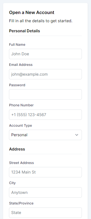
Step 2: Adapting to Desktop
As we transition to larger screens, we seize the opportunity to optimize space and enhance the form's organization. To achieve this, we embrace a two-column grid layout, a stark contrast to the mobile layout.
To implement our desktop-adaptive layout, we introduce a new div element that wraps around the personal and address details sections. By applying Tailwind's responsive grid classes to this wrapper, we effectively distribute the form sections side by side, creating a more engaging and user-friendly interface on desktop screens. Here's a glimpse into how this is coded:
This layout utilizes Tailwind's lg:grid class to activate the grid display on larger screens and lg:grid-cols-2 to define a two-column grid. The lg:gap-x-10 class introduces a gap between the columns, ensuring the content is neatly separated and easy to read.
Code Snippet
<div className="lg:grid lg:grid-cols-2 lg:gap-x-10"> <!-- Personal Details Section --> <div> <!-- Fields for personal details --> </div> <!-- Address Details Section --> <div> <!-- Fields for address details --> </div></div>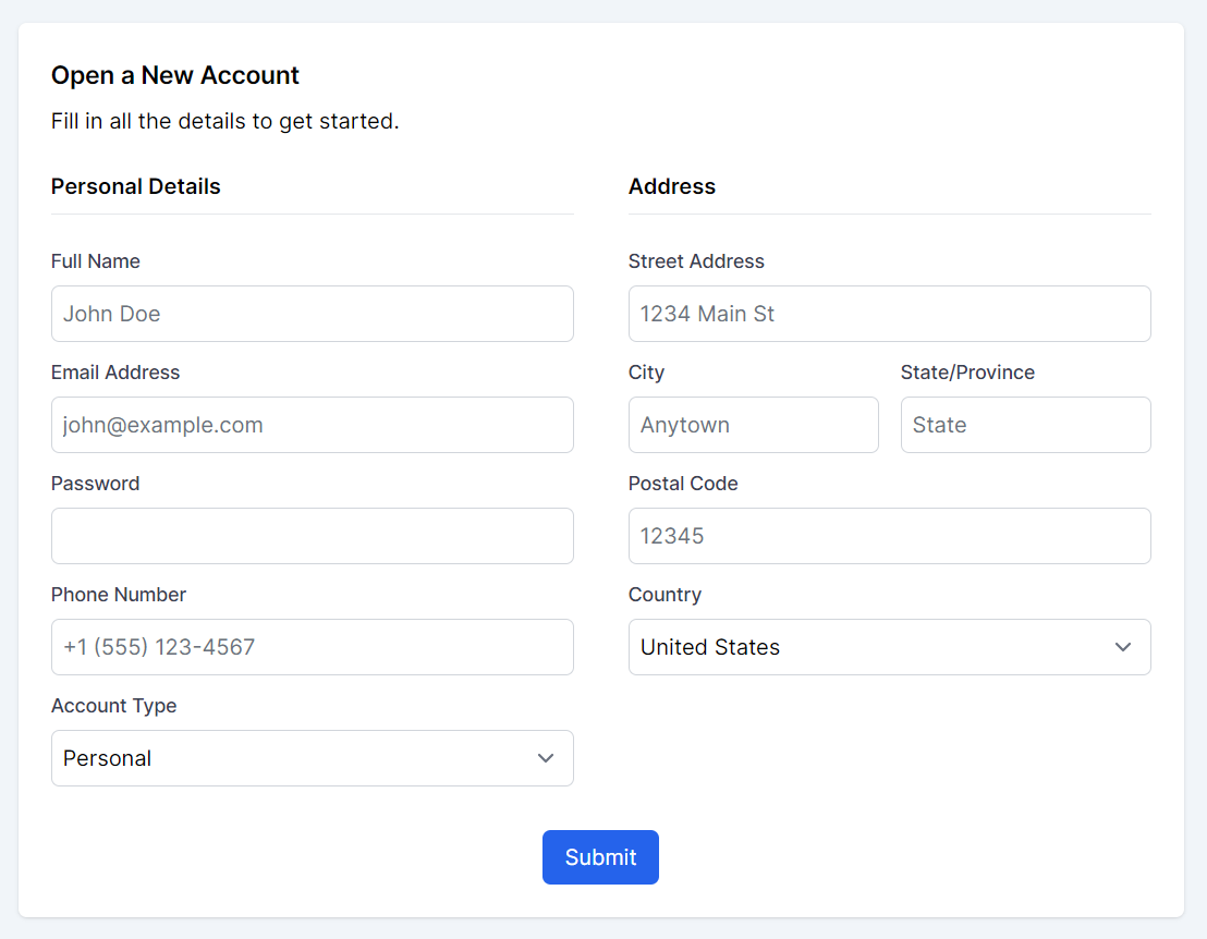
Conclusion
By adopting a mobile-first design and using Tailwind CSS for responsive adjustments, we craft a form that's not only functional and accessible on mobile devices but also optimizes space and improves user experience on desktop screens. This strategy demonstrates our commitment to responsive design, ensuring our form is intuitive and efficient across all devices.
Further Improvements
In the mobile-first design landscape, where screen space is limited and attention spans are brief, optimizing the user experience for form completion is crucial. Large forms, which require the collection of extensive user data, present a particular challenge. To address this, we adopt an innovative strategy that goes beyond the traditional single-column layout: the Form Flow Steps Pattern.
Form Flow Steps is a design strategy that facilitates a step-by-step progression through forms. This pattern emphasizes a seamless transition from one section to the next, transforming lengthy form processes into manageable, bite-sized steps. Such an approach not only mitigates the risk of overwhelming users with excessive information at once but also provides a structured and guided user experience. By segmenting forms into distinct steps, we significantly boost usability and user interaction on mobile devices, ensuring that forms are not just easy to fill out but also engaging and accessible.
This pattern is particularly effective in enhancing mobile user experiences, where navigating through dense information can be daunting. Form Flow Steps streamline the form-filling process, making it more intuitive and less time-consuming for users. As a result, users are more likely to complete forms, leading to higher engagement rates and better data collection outcomes.
Implementing Form Flow Steps in the account opening form
In the account opening form, we have already two sections and we can take the user input in case of mobile in two steps first taking personal details and then taking address details.
We will use React's state management to toggle between form sections, making the experience interactive and user-friendly. By initializing a step state, you can control the visibility of form sections (i.e., "personal" and "address") and guide the user through the form completion process in a structured manner.
Step-wise Form Completion
Personal Details Section: Initially, the form presents the "Personal Details" section. This section captures essential user information, such as name, email, password, phone number, and account type. The form layout remains in a single-column format, adhering to mobile-first principles. This focused approach allows users to concentrate on one category of information at a time, reducing overwhelm and improving form completion rates.
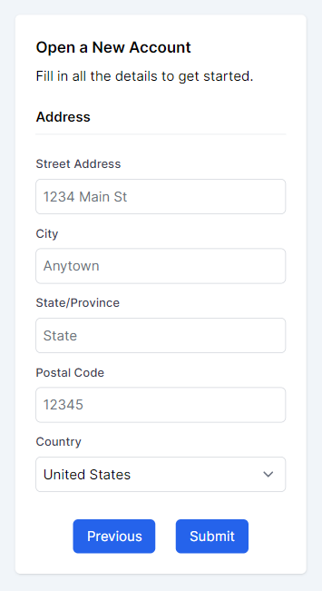
Address Section: Upon completing the personal details, users can proceed to the "Address" section by clicking the "Next" button. This section requests address-related information, including street address, city, state/province, postal code, and country. Similar to the personal details section, this layout ensures information is presented clearly and concisely.
Code Snippet
const [step, setStep] = useState("personal"); const changeStep = (step: string) => { setStep(step); }; return ( <div className='py-20 flex flex-col gap-10'> <div className=''> <div className='mb-10'>Form</div> <form className="p-6 bg-white rounded-md shadow"> <h2 className="text-lg font-semibold mb-2">Open a New Account</h2> <div>Fill in all the details to get started.</div> <div className='lg:grid lg:grid-cols-1 lg:gap-10'> {step == "personal" && <div className='col-span-1 mt-6'> <h4 className="text-md font-semibold">Personal Details</h4> <hr className='mt-2 mb-6' /> ..... </div>} {step == "address" && <div className='col-span-1 mt-6'> <h4 className="text-md font-semibold">Address</h4> <hr className='mt-2 mb-6' /> ... </div>} </div> {step == "personal" && <div className="flex justify-center mt-8"> <button onClick={() => changeStep("address")} type="submit" className="px-4 py-2 text-white bg-blue-600 rounded-md hover:bg-blue-700"> Next</button> </div>} {step == "address" && <div className="flex justify-center mt-8 gap-6"> <button onClick={() => changeStep("personal")} type="submit" className="px-4 py-2 text-white bg-blue-600 rounded-md hover:bg-blue-700">Previous</button> <button type="submit" className="px-4 py-2 text-white bg-blue-600 rounded-md hover:bg-blue-700">Submit</button> </div>} </form> </div> </div> )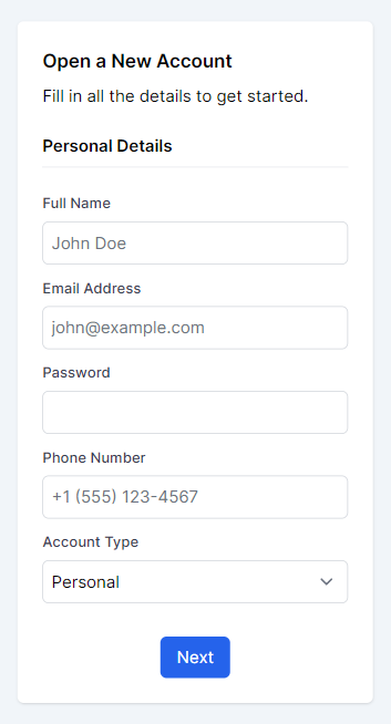
By breaking down the form into smaller, manageable sections and providing clear navigation options, we can make the form completion process more engaging and less overwhelming for users.
In this lesson, we've delved into the Form Flex Adapt design pattern and explored the Form Flow Steps strategy, both of which are essential for creating user-friendly, responsive forms. These approaches simplify complex form navigation, making it easier for users to input their information across different devices. By breaking down forms into manageable sections and guiding users through a structured process, we enhance the overall user experience, ensuring forms are not only accessible but also engaging.
In this lesson, we will explore the Space Crafting responsive design pattern, which focuses on optimizing the use of available space in user interfaces across various screen sizes and resolutions. We will learn how padding and margins can be adjusted dynamically for different devices to ensure a cohesive and accessible user experience.
All Modules