✅ Now Live: Advanced Order Store for All Business Types – Rentals, Services, Subscriptions & More!✅ Now Live: Advanced Order Store for All Business Types – Rentals, Services, Subscriptions & More!✅ Now Live: Advanced Order Store for All Business Types – Rentals, Services, Subscriptions & More!✅ Now Live: Advanced Order Store for All Business Types – Rentals, Services, Subscriptions & More!✅ Now Live: Advanced Order Store for All Business Types – Rentals, Services, Subscriptions & More!✅ Now Live: Advanced Order Store for All Business Types – Rentals, Services, Subscriptions & More!✅ Now Live: Advanced Order Store for All Business Types – Rentals, Services, Subscriptions & More!✅ Now Live: Advanced Order Store for All Business Types – Rentals, Services, Subscriptions & More!✅ Now Live: Advanced Order Store for All Business Types – Rentals, Services, Subscriptions & More!✅ Now Live: Advanced Order Store for All Business Types – Rentals, Services, Subscriptions & More!
Type Scale Dynamics
In this design pattern, we will explore the Type Scale Dynamics responsive design pattern, which focuses on adjusting typography dynamically to maintain readability and visual hierarchy across different screen sizes.
Type Scale Dynamics
The "Type Scale Dynamics" design pattern refers to the practice of adjusting typography sizes and spacings responsively across different screen sizes to maintain readability, hierarchy, and user engagement. This approach ensures that text elements such as headlines, body text, and captions are legible and appropriately scaled whether viewed on a small mobile device or a large desktop screen.
How It Works
Responsive typography adapts to the viewport size using relative units (like rem, em) and CSS media queries, or through utility-first CSS frameworks like Tailwind CSS, which provides a set of responsive font size utilities out of the box.
Lets understand this design pattern by looking at the practical use case:
Requirement: Responsive Typography for a News Article
Creating a news article webpage requires careful consideration of typography to ensure the content is engaging and accessible across various devices.
The goal is to implement a responsive type scale that adjusts the size of the heading, subtitle, and body text to maintain readability and hierarchy at different resolutions. This approach helps users easily navigate through the content, whether they're reading on a small mobile screen or a large desktop monitor.
Key Elements:
- News Heading: The most prominent text element, designed to capture attention and convey the article's main topic.
- Subtitle: Provides additional context or a summary of the news article, slightly smaller than the heading but still prominent.
- Body Text: The main content of the article, offering detailed information. It should be easily readable on all devices, with comfortable line lengths and spacing.
Implementing Responsive Typography with Tailwind CSS
Here's how you can use Tailwind CSS to achieve a responsive type scale for a news article:
Step 1: Establish Base Typography for Mobile
For mobile devices, where screen real estate is limited, it's crucial to ensure that text is readable without overwhelming the viewer. Thus, we begin by setting base font sizes that cater to smaller screens.
In this setup, the 'text-xl' for the heading, 'text-lg' for the subtitle, and 'text-base' for the body text are chosen to ensure optimal readability on mobile screens. The margins (mb-2, mb-3) help maintain visual separation between text elements.
Code Snippet
<article className="p-5"> <h1 className="text-xl font-bold mb-2">Major Event Shakes the City</h1> <h2 className="text-lg mb-3">A closer look at the unprecedented event that unfolded last night.</h2> <p className="text-base"> In an unexpected turn of events last night, the city witnessed something it had never seen before... </p> </article>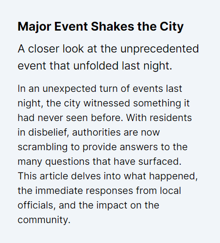
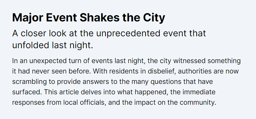
Step 2: Scale Typography for Larger Screens
Next, we introduce Tailwind CSS's responsive utility classes to adjust font sizes for larger viewports, enhancing readability and maintaining visual hierarchy as more space becomes available.
By adding md: and lg: prefixes to font size classes (md:text-3xl, lg:text-4xl for the heading, etc.), we specify larger font sizes for medium (md) and large (lg) screen sizes. This approach follows the mobile-first principle by starting with styles for the smallest devices and then progressively enhancing the design for larger screens.
Code Snippet
<article className="p-5"> <h1 className="text-xl md:text-3xl lg:text-4xl font-bold mb-2">Major Event Shakes the City</h1> <h2 className="text-lg md:text-2xl lg:text-3xl mb-3">A closer look at the unprecedented event that unfolded last night.</h2> <p className="text-base md:text-lg lg:text-xl"> In an unexpected turn of events last night, the city witnessed something it had never seen before... </p> </article>Tablet View (iPad)
Conclusion:
This mobile-first approach to responsive typography prioritize content legibility and accessibility on the most constrained devices first, then progressively enhance the experience for larger screens. Utilizing Tailwind CSS's responsive utilities, you can efficiently scale typography to maintain an engaging and hierarchical presentation of text across all device sizes. This methodology not only adheres to best practices in responsive web design but also ensures a seamless reading experience for users, regardless of how they access the news article.
Standardizing Typography Across Your Application
- In our previous examples, we demonstrated how to apply responsive typography to header tags, enhancing readability across various devices like tablets and desktops.
- To achieve a uniform typographic approach throughout an application with multiple components, it's efficient to standardize these styles. This can be accomplished by customizing Tailwind CSS to include global styles in the base layer.
- To standardize typography, we'll extend Tailwind's base styles using the @layer base directive in CSS. This method is executed after importing Tailwind's foundational styles. Adopting this strategy ensures a consistent typographic scale and style is applied universally across your project, simplifying component code by eliminating the need for repetitive class applications.
global.css
Code Snippet
@layer base { h1 { @apply text-xl md:text-3xl lg:text-4xl font-bold; } h2 { @apply text-lg md:text-2xl lg:text-3xl font-semibold; } p { @apply text-base md:text-lg lg:text-xl; }}- By incorporating these styles into the global.css file, we effectively streamline our markup. Consequently, individual component classes that manually adjust typography can be removed, promoting cleaner and more maintainable code.
- With the global typographic styles in place, our article component becomes more succinct. The responsiveness and visual hierarchy are preserved without explicitly setting utility classes for each element.
Code Snippet
<article className="p-5"> <h1 className="mb-2">Major Event Shakes the City</h1> <h2 className="mb-3">A closer look at the unprecedented event that unfolded last night.</h2> <p> In an unexpected turn of events last night, the city witnessed something it had never seen before... </p> </article>This approach not only ensures that all typography within the application adheres to a unified style but also reduces the effort required to maintain consistency as your project evolves.
By leveraging Tailwind CSS's capabilities to define global styles, developers can focus more on content and functionality, knowing that the presentation layer remains consistent and aligned with the design system.
In this lesson, we'll explore the See-Hide responsive design pattern, focusing on optimizing content visibility across devices. We'll discuss how to strategically show or hide elements to improve user experience and interface clarity.
All Modules