✅ Now Live: Advanced Order Store for All Business Types – Rentals, Services, Subscriptions & More!✅ Now Live: Advanced Order Store for All Business Types – Rentals, Services, Subscriptions & More!✅ Now Live: Advanced Order Store for All Business Types – Rentals, Services, Subscriptions & More!✅ Now Live: Advanced Order Store for All Business Types – Rentals, Services, Subscriptions & More!✅ Now Live: Advanced Order Store for All Business Types – Rentals, Services, Subscriptions & More!✅ Now Live: Advanced Order Store for All Business Types – Rentals, Services, Subscriptions & More!✅ Now Live: Advanced Order Store for All Business Types – Rentals, Services, Subscriptions & More!✅ Now Live: Advanced Order Store for All Business Types – Rentals, Services, Subscriptions & More!✅ Now Live: Advanced Order Store for All Business Types – Rentals, Services, Subscriptions & More!✅ Now Live: Advanced Order Store for All Business Types – Rentals, Services, Subscriptions & More!
Hover, Focus and Other Modifiers
Discover Tailwind CSS's modifier classes like 'hover' and 'focus' to craft dynamic designs. Learn to apply these for enhanced user interactions, such as button style changes on hover and input highlighting on focus.
In CSS, there are approximately seven distinct categories of modifiers. In this module, we will delve into each of these categories in detail, equipping you with the knowledge to effectively apply them in your applications.
Pseudo-Classes for User Interaction:
Pseudo-classes for user interaction in CSS play a crucial role in enhancing the user experience by providing visual feedback based on user actions or the state of an element. Here's an explanation of each pseudo-class and typical scenarios in which they're used:
1. hover (&:hover):
Applied when a user's mouse pointer hovers over an element.
Common Use: Changing the color, background, or border of buttons and links on hover to indicate that they are clickable.
2. focus (&:focus):
Activated when an element receives focus, typically through keyboard input (like tabbing) or by clicking.
Common Use: Highlighting text fields, dropdowns, or other form elements to indicate they are currently active or ready for input.
3. focus-within (&:focus-within):
Applied to a parent element when any of its children receive focus.
Common Use: Styling form components or card layouts to highlight the entire section when one of its elements is in focus.
4. focus-visible (&:focus-visible):
Similar to focus, but specifically targeted at keyboard interactions, enhancing accessibility.
Providing visible focus indicators (like outlines) to elements when navigated via keyboard, without affecting mouse click interactions.
5. active (&:active):
Triggered when an element is being activated by a user, such as during a mouse click.
Common Use: Changing the style of buttons or links while they are being pressed to provide feedback of interaction.
6. visited (&:visited):
Applied to links that the user has already visited.
Common Use: Altering the color of visited links to differentiate them from unvisited ones, enhancing the browsing experience.
Now we have understood the pseudo classes for user interactions, lets see how these can be used using Tailwind CSS
Example 1: Button with hover, focus and active state
Code Snippet
<button className="bg-sky-500 hover:bg-sky-700 focus:bg-sky-400 focus:outline-none focus:ring focus:ring-sky-300 active:bg-sky-800 text-white font-medium py-2 px-4 rounded"> Subscribe Now </button>Here is the explanation of each class applied to the button:
- bg-sky-500: Default background color of the button, a specific shade of sky blue.
- hover:bg-sky-700: Darkens the background on mouse hover.
- focus:bg-sky-400: Lightens the background when focused, aiding accessibility.
- focus:outline-none: Removes default focus outline for custom styles.
- focus:ring: Adds a focus ring for accessibility indication.
- focus:ring-sky-300: Specifies the focus ring color.
- active:bg-sky-800: Darkens the background when clicked.
- text-white: Sets text color to white for contrast.
- font-medium: Applies medium font weight.
- py-2 px-4: Adds padding for spacing.
- rounded: Adds rounded corners for a modern look.

Example 2: focus-within
In this example, when the user focuses on the email input field, the border color of the entire div changes, thanks to the focus-within:border-sky-500 class. This effectively highlights the entire input group, enhancing user experience, especially in forms with multiple fields.
Code Snippet
<div className="p-4 border-2 border-gray-300 rounded focus-within:border-sky-500"> <label htmlFor="email" className="block text-sm font-medium text-gray-700">Email</label> <input type="email" id="email" name="email" className="mt-1 block w-full px-3 py-2 bg-white border border-gray-300 rounded-md shadow-sm focus:outline-none focus:ring focus:ring-blue-200 focus:border-sky-500" placeholder="you@example.com" /> </div>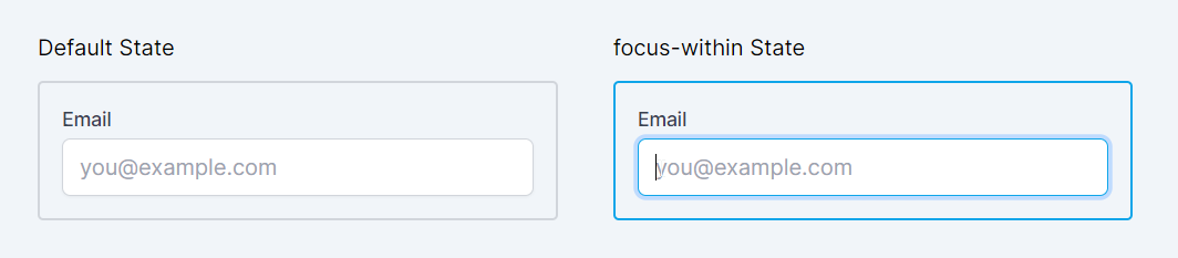
In this lesson, we'll explore the concept of structural pseudo-classes in CSS, which are key to targeting elements based on their position and relation in the document hierarchy. We'll learn how these pseudo-classes, such as first-child, last-child, and nth-child, enable precise styling of specific elements within a group. Understanding these will be crucial for creating layouts and designs that are both dynamic and responsive.
All Modules