✅ Now Live: Advanced Order Store for All Business Types – Rentals, Services, Subscriptions & More!✅ Now Live: Advanced Order Store for All Business Types – Rentals, Services, Subscriptions & More!✅ Now Live: Advanced Order Store for All Business Types – Rentals, Services, Subscriptions & More!✅ Now Live: Advanced Order Store for All Business Types – Rentals, Services, Subscriptions & More!✅ Now Live: Advanced Order Store for All Business Types – Rentals, Services, Subscriptions & More!✅ Now Live: Advanced Order Store for All Business Types – Rentals, Services, Subscriptions & More!✅ Now Live: Advanced Order Store for All Business Types – Rentals, Services, Subscriptions & More!✅ Now Live: Advanced Order Store for All Business Types – Rentals, Services, Subscriptions & More!✅ Now Live: Advanced Order Store for All Business Types – Rentals, Services, Subscriptions & More!✅ Now Live: Advanced Order Store for All Business Types – Rentals, Services, Subscriptions & More!
Speed Craft
In this lesson, we will look at the Speed Craft Strategies that are pivotal in enhancing web page performance. These strategies ensure rapid load times and fluid user interactions across diverse devices and networks.
The Speed Craft Strategies design pattern is pivotal in enhancing web page performance, ensuring rapid load times and fluid user interactions across diverse devices and networks. This pattern plays a crucial role in responsive design, significantly influencing user experience, engagement, and satisfaction. Below are the refined key aspects and considerations for implementing Speed Craft Strategies:
1. Efficient Resource Loading
Lazy Loading of images
Images, videos, and other resource-intensive files are loaded only as they're about to enter the viewport, considerably reducing the initial page load time. Use the loading="lazy" attribute in <img> tags to enable this feature, compatible with most modern browsers.
For broader compatibility, consider implementing a JavaScript-based fallback for older browsers.
Lazy Loading with React's Suspense:
Suspense for React allows for the lazy loading of components and data, enhancing performance by loading only what's necessary for the current view. It offers a fallback UI to keep users informed during content loading, thus enhancing the user experience.
With Suspense, developers can specify a fallback UI component (such as loaders or placeholders) to be displayed while the main content is loading. This feature provides users with immediate feedback that content is being loaded, minimizing the perception of delay. It effectively prevents the disorienting effect of a blank screen or abrupt content shifts, making for a smoother browsing experience.
The following code snippet demonstrates how we can utilize the Suspense component to lazily load a more substantial component that requires an API call to fetch a list. We also leverage a fallback UI, enhanced with engaging animations provided by Tailwind CSS, to improve the user experience during the loading process.
Code Snippet
      <div className="flex flex-col items-center justify-center min-h-screen">
        <Suspense fallback={<FallbackUI />}>
          <ListComponent/>
        </Suspense>
      </div>
Combining CSS and JavaScript Files:
Minimize server requests by combining CSS and JavaScript files. Use asynchronous or deferred loading to prevent scripts from blocking page content rendering, optimizing page load speed.
Next.js automatically minimizes CSS files in production builds. When you build your Next.js application for production by running next build, Next.js uses its built-in webpack configuration to optimize your application. This optimization includes minifying CSS (and JavaScript) files to reduce their size, which improves loading times and overall performance for your end users.
This behavior is part of Next.js's commitment to performance "out of the box." It means you don't need to manually configure CSS minification through PostCSS plugins when using Next.js, as it is already handled for you during the production build process.
2. Optimizing Assets
Responsive Images
Implement responsive images using the srcset attribute in <img> tags to serve different image sizes based on the user's device. This prevents mobile devices from downloading large desktop-sized images, saving bandwidth and improving load times.
To use responsive images with the srcset attribute in HTML, you define different image sources for different screen sizes or resolutions. This lets the browser select the most appropriate image source based on the current device's screen size and resolution, improving loading times and conserving bandwidth. Here's how you might use it:
Code Snippet
<img src="example-small.jpg" srcset="example-small.jpg 500w, example-medium.jpg 1000w, example-large.jpg 1500w" sizes="(max-width: 600px) 500px, (max-width: 900px) 1000px, 1500px" alt="Example image">src: A fallback for browsers that don't support srcset.
srcset: Defines a list of image sources along with their widths. The 500w, 1000w, and 1500w are the widths of the images in pixels.
sizes: Tells the browser how wide the image will be at different breakpoints. The browser uses this information to select the most appropriate image source from the srcset.
How Next.js Image Component Improves It
Next.js provides an Image component that simplifies the implementation of responsive images and adds additional performance optimizations:
- Automatic Image Optimization: The Image component automatically optimizes images on-demand, as users request them, without requiring you to manually optimize images during build time or maintain multiple versions for different resolutions.
- Lazy Loading: Images are loaded lazily by default, meaning they are only loaded when they enter the viewport, further improving the performance of your web pages.
- Responsive Loading: The Image component automatically generates multiple sizes of each image and serves the optimal size based on the device's screen width and the viewport size, without the need for manually defining srcset and sizes.
Code Snippet
      <Image
        src="/background-image.webp" // Path to the image
        alt="background image"
        width={500} // Desired width of the image
        height={300} // Desired height of the image
      />
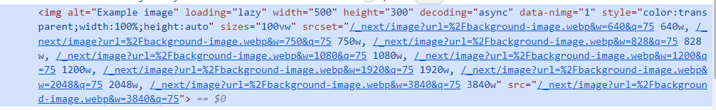
Image Optimization
Image optimization is a crucial step in improving web performance, enhancing user experience by reducing load times, and conserving bandwidth. Here's how you can approach it:
- Compression Without Losing Quality: Modern image formats and compression tools allow you to significantly reduce the file size of images without a noticeable loss in quality. Tools like TinyPNG, ImageOptim, or online services can automatically compress JPEG and PNG files efficiently.
- Using WebP Format: WebP is a modern image format that provides superior lossless and lossy compression for images on the web. Compared to JPEG, PNG, and GIF, WebP images are smaller, which means faster downloads and less data consumption. Most modern browsers support WebP.
Use SVGs
SVG (Scalable Vector Graphics) is an XML-based vector image format for two-dimensional graphics with support for interactivity and animation. SVGs are ideal for icons, logos, and illustrations for several reasons:
- Scalability: Unlike bitmap images (like JPEGs and PNGs), SVGs can scale to any size without losing clarity or quality. This makes them perfect for high-resolution displays.
- Small File Size: SVGs often have smaller file sizes compared to bitmap images, especially for simple shapes or icons. This reduces load times and bandwidth usage.
- CSS and JavaScript Interactivity: SVGs can be styled and animated with CSS and manipulated with JavaScript, offering a wide range of visual effects and interactivity.
- Accessibility: Since SVGs are XML files, you can add titles, descriptions, and accessible names directly within the SVG markup, improving accessibility.
When using SVGs, it's essential to optimize them to remove unnecessary metadata, comments, or hidden elements that can bloat file sizes. Tools like SVGO (a Node.js-based tool for optimizing SVG files) or online services can clean up and minimize SVG files for you.
Conclusion:
Implementing Speed Craft Strategies requires a holistic approach, involving both front-end optimizations and server-side configurations. Web developers and designers should use tools like Google's PageSpeed Insights, Lighthouse, and WebPageTest to analyze and monitor the performance of web pages, identifying areas for improvement.
By prioritizing performance through Speed Craft Strategies, web professionals can significantly enhance the user experience, especially on mobile devices where network conditions vary, and processing power is limited compared to desktop devices. This pattern underscores the importance of performance as a fundamental aspect of responsive web design, ensuring that web applications are fast, efficient, and accessible to users worldwide, regardless of their device or network conditions.
In this lesson, we will look at the Access Design Principles, which aim to ensure that digital content is within reach for everyone, including individuals with disabilities.
All Modules