✅ Now Live: Advanced Order Store for All Business Types – Rentals, Services, Subscriptions & More!✅ Now Live: Advanced Order Store for All Business Types – Rentals, Services, Subscriptions & More!✅ Now Live: Advanced Order Store for All Business Types – Rentals, Services, Subscriptions & More!✅ Now Live: Advanced Order Store for All Business Types – Rentals, Services, Subscriptions & More!✅ Now Live: Advanced Order Store for All Business Types – Rentals, Services, Subscriptions & More!✅ Now Live: Advanced Order Store for All Business Types – Rentals, Services, Subscriptions & More!✅ Now Live: Advanced Order Store for All Business Types – Rentals, Services, Subscriptions & More!✅ Now Live: Advanced Order Store for All Business Types – Rentals, Services, Subscriptions & More!✅ Now Live: Advanced Order Store for All Business Types – Rentals, Services, Subscriptions & More!✅ Now Live: Advanced Order Store for All Business Types – Rentals, Services, Subscriptions & More!
Adaptive Cards Layout
The lesson discusses designing adaptive cards to dynamically adjust their layout for optimal viewing on various devices, ensuring a seamless user experience across different screen sizes.
The "Adaptive Layout Cards" design pattern is a responsive and flexible approach to organizing content into card-based components within a web interface. This pattern is characterized by its ability to adjust the card layouts dynamically to fit different screen sizes and orientations, ensuring an optimal user experience across all devices.
By utilizing a combination of CSS Flexbox and Grid layout techniques, the Adaptive Layout Cards design pattern offers a powerful solution for displaying collections of information in a visually appealing and accessible manner.
How It Works
The Adaptive Layout Cards pattern relies on CSS properties that enable content to flow within a container based on predefined rules and constraints. Two primary CSS layout models are:
1. Using CSS Flexbox
Flexbox is designed for one-dimensional layouts, either in rows or columns. It allows for the distribution of space along a single axis, making it ideal for linear arrangements of cards that need to wrap within a container.
2. Using CSS Grid
Grid layout excels in two-dimensional designs, allowing for both rows and columns to be defined and aligned. It offers precise control over the layout and positioning of card components.
Scenario: E-Commerce Product Gallery
Imagine you're tasked with creating a responsive product gallery for an online clothing store. The gallery should display products in an organized, aesthetically pleasing manner across various devices. Each product card includes an image, product name, price, and a "Quick View" button.
For this scenario, CSS Grid is ideal because it provides:
- Two-Dimensional Control: You can easily manage both rows and columns, adjusting the number of products per row as the screen size changes.
- Gap Control: Easily adjust spaces between products both vertically and horizontally without additional wrappers or complex calculations.
- Item Placement Flexibility: Place promotional items or banners spanning multiple columns or rows without disrupting the overall layout.
- Consistent Alignment: Ensure that all items align perfectly, regardless of content size, for a cleaner, more professional look.
Step 1: Grid Container Setup
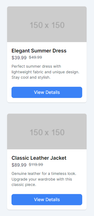
We initiate our grid with a single-column layout to cater to mobile devices. This configuration ensures that on smaller screens, items are stacked vertically, offering clear visibility and facilitating easy interaction for mobile users.
Code Snippet
<div className="grid grid-cols-1 p-4">
</div>
Step 2: Loop through the product array and render the products:
The product details are stored in an array within a separate file, which we then import for display.
Code Snippet
export const products = [
    {
      id: 1,
      image: "https://via.placeholder.com/150",
      name: "Elegant Summer Dress",
      sellingPrice: "$39.99",
      listPrice: "$49.99",
      tagline: "Perfect summer dress with lightweight fabric and unique design. Stay cool and stylish.",
    },     .....]
Gap Configuration: The gap-10 utility is applied to the grid container to ensure consistent spacing both vertically (between rows) and horizontally (between columns) across all breakpoints. This spacing creates a visually appealing layout that prevents items from appearing too cramped, regardless of the screen size.
Code Snippet
<div className="grid grid-cols-1 gap-10 p-4"> {products.map((product) => ( <div key={product.id} className="bg-white shadow rounded-lg overflow-hidden flex flex-col"> <img src={product.image} alt={product.name} className="object-cover" /> <div className="p-4 flex flex-grow flex-col justify-between"> <div> <h3 className="font-semibold text-lg">{product.name}</h3> <div className="text-gray-800 flex gap-2"> <span>{product.sellingPrice}</span> <span className="line-through text-gray-500 text-sm"> {product.listPrice} </span> </div> <div className="text-gray-600 text-sm my-2">{product.tagline}</div> </div> <button className="mt-4 bg-blue-500 hover:bg-blue-700 text-white rounded-lg px-4 py-2">View Details</button> </div> </div> ))} </div>As a result, we achieve a nicely organized product listing in the mobile view.
Step 3: Responsive Column Adjustments:
Next, we adjust the grid for other breakpoints to enhance responsiveness:
- Small Devices (sm breakpoint): At this breakpoint, we adjust the grid to display two columns. This modification caters to larger phones or small tablets in portrait mode, utilizing the available screen width more effectively by placing items side by side.
- Medium Devices (md breakpoint): As we move to medium-sized devices, such as tablets or small desktop screens, the grid expands to accommodate three columns. This layout adjustment ensures that the content is distributed more evenly, enhancing the overall aesthetic and usability.
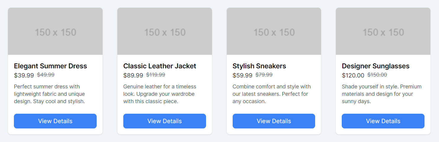
- Large Devices (lg breakpoint): For large devices, including desktops and larger tablets in landscape orientation, we increase the number of columns to four. This maximizes the use of space on wide screens, allowing users to view more content simultaneously without overwhelming the design.
Code Snippet
<div className="grid grid-cols-1 sm:grid-cols-2 md:grid-cols-3 lg:grid-cols-4 gap-10 p-4">.....</div>
After applying these changes, the final result in the desktop view showcases an adaptable and visually appealing product gallery that ensures an optimal viewing experience across devices.
Other Considerations
In the above React component, Flexbox utilities from Tailwind CSS are used within a loop to create a responsive grid of product cards. Let's break down why flex, flex-col, and flex-grow classes are utilized and how they contribute to the layout's consistency and responsiveness.
Flexbox in Product Cards
flex and flex-col: These classes are used together on the card container (<div> surrounding the product image, name, price, and button) to create a flex container with a column direction. This means the content inside each product card (image, details, button) is laid out vertically, one on top of the other, aligning with the natural flow of the content.
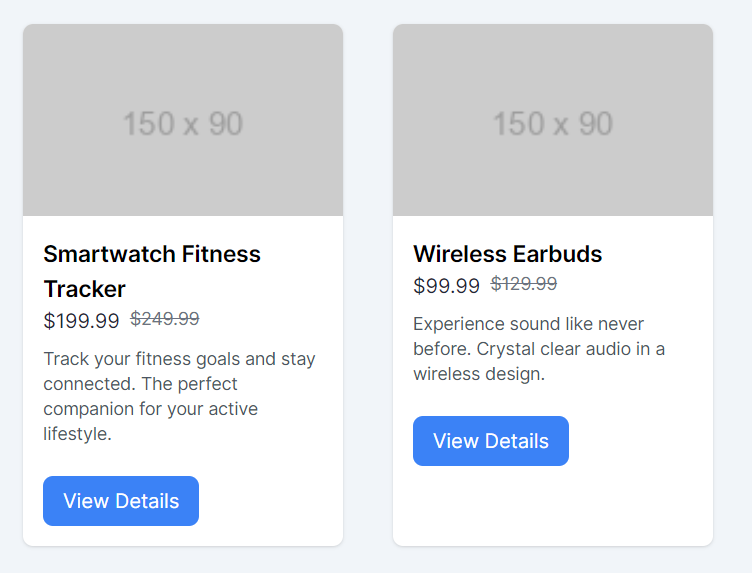
flex-grow: Applied to the <div> that wraps the product details and the "View Details" button, flex-grow ensures that this container expands to fill any available space within the card. This is crucial for aligning the "View Details" button at the bottom of the card, especially when the product descriptions vary in length.
Aligning the "View Details" Button
When product descriptions vary, causing the content height to differ from one product card to another, the "View Details" button might not align consistently across all cards. This discrepancy can lead to a visually disjointed appearance.
The combination of flex, flex-col, and particularly flex-grow within the card's content container addresses this issue by:
- Ensuring that the button aligns at the bottom: The flex-grow class on the content container pushes the "View Details" button to the bottom of the card, maintaining visual consistency across the grid.
- Creating space between content: The justify-between utility (implied by the structure and flex-grow usage) distributes space between the card's main content and the button, effectively "pinning" the button to the bottom edge of the card.
Handling Variable Content Length
For longer product descriptions that might push the button too far down or create inconsistency in card heights, you have two primary options:
- Truncating Text: Limit the product description to a specific number of lines, using Tailwind's line-clamp utilities (e.g., line-clamp-2 for two lines). This keeps the content size consistent across cards.
- Leveraging Flexbox: As done in this example, using flex-grow and flex-col ensures the button stays at the bottom, regardless of the content length above it.
By employing Flexbox utilities effectively within each product card, this design pattern ensures that all cards maintain a uniform appearance, with key elements like the "View Details" button consistently placed, enhancing the overall aesthetic and usability of the product grid. This approach demonstrates a thoughtful application of CSS Flexbox for responsive web design, addressing common challenges presented by variable content lengths.
In this lesson we will look at magic menus responsive design pattern focuses on creating navigational elements that adapt to different screen sizes, ensuring intuitive access to content across devices. It highlights techniques for menus that automatically adjust their structure and presentation for efficiency and user-friendliness.
All Modules