✅ Now Live: Advanced Order Store for All Business Types – Rentals, Services, Subscriptions & More!✅ Now Live: Advanced Order Store for All Business Types – Rentals, Services, Subscriptions & More!✅ Now Live: Advanced Order Store for All Business Types – Rentals, Services, Subscriptions & More!✅ Now Live: Advanced Order Store for All Business Types – Rentals, Services, Subscriptions & More!✅ Now Live: Advanced Order Store for All Business Types – Rentals, Services, Subscriptions & More!✅ Now Live: Advanced Order Store for All Business Types – Rentals, Services, Subscriptions & More!✅ Now Live: Advanced Order Store for All Business Types – Rentals, Services, Subscriptions & More!✅ Now Live: Advanced Order Store for All Business Types – Rentals, Services, Subscriptions & More!✅ Now Live: Advanced Order Store for All Business Types – Rentals, Services, Subscriptions & More!✅ Now Live: Advanced Order Store for All Business Types – Rentals, Services, Subscriptions & More!
Backgrounds
In this lesson, we will delve into the implementation of background images on HTML elements. Additionally, we will explore various properties that provide control over these background images, including options for adjusting their size and determining whether they should repeat. This knowledge will empower you to customize the visual appearance of your web content effectively.
In web design and CSS, a background image is an image that is applied to the background of an HTML element, such as a <div>, <section>, or the entire page. Background images are used to enhance the visual appearance of a webpage by providing a decorative or illustrative backdrop behind content. This can be applied in the code using the background-image CSS property.
Code Snippet
<div style={{backgroundImage: "url('/image.avif')"}}> ..... </div>There are a number of options available to control the size and position of the background image applied to the element, and these are described below.
1. Background Size:
Tailwind CSS provides utility classes for controlling the size of background images. When the dimensions of the background image and the dimensions of the element differ, Background Size determines which portion of the image is displayed in the background
Here are the classes and their properties:
- bg-auto: Sets the background size to "auto," which means the image is displayed at its original size.
- bg-cover: Scales the background image to cover the entire element's content area while maintaining its aspect ratio. This may result in some parts of the image being cropped if it doesn't match the element's dimensions.
- bg-contain: Scales the background image to fit within the element's content area while maintaining its aspect ratio. The entire image is visible, but there may be empty space around it if the element's dimensions differ from the image's aspect ratio.
Examples:
a. bg-auto:
Code Snippet
<div className="w-2/3 h-40 flex items-center justify-center border border-slate-500 rounded bg-auto" style={{backgroundImage: "url('/image.avif')"}}> <div className='text-2xl text-white'>bg-auto</div></div>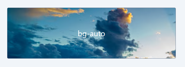
b. bg-cover:
Code Snippet
<div className="w-2/3 h-40 flex items-center justify-center border border-slate-500 rounded bg-cover" style={{ backgroundImage: "url('/image.avif')" }}> <div className='text-2xl text-white'>bg-cover</div></div>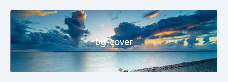
c. bg-contain:
Code Snippet
<div className="w-2/3 h-40 flex items-center border border-slate-500 rounded bg-contain bg-no-repeat" style={{ backgroundImage: "url('/image.avif')" }}> <div className='text-2xl text-white px-6'>bg-contain</div></div>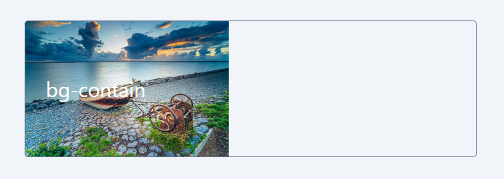
When bg-cover is applied, some parts of the image are clipped to make it cover the entire element. This happens because the aspect ratio of the image and the element may be different. On the other hand, with bg-contain, we can see the entire image, but it doesn't necessarily cover the entire div as it maintains the image's aspect ratio.
2. Background Repeat:
Background repeat properties determine how background images are tiled or repeated within an element. When the element's dimensions exceed those of the image, the Background Repeat property decides whether to repeat the image or maintain it as a single instance.
Here are the Tailwind CSS classes for background repeat:
- bg-repeat: The background image is repeated both horizontally and vertically to fill the element's content area.
- bg-no-repeat: The background image is not repeated, and only one instance of the image is displayed within the element's content area.
- bg-repeat-x: The background image is repeated horizontally (left to right) to fill the element's content area, but not vertically.
- bg-repeat-y: The background image is repeated vertically (top to bottom) to fill the element's content area, but not horizontally.
- bg-repeat-round: The background image is repeated both horizontally and vertically, and the image is scaled to ensure that there is no partial image displayed at the edges of the element.
- bg-repeat-space: Similar to bg-repeat, the background image is repeated both horizontally and vertically, but the space between the repeated images is evenly distributed, ensuring that there is no partial image displayed at the edges of the element.
Examples:
a. no-repeat
Code Snippet
<div className="w-2/3 h-40 flex items-center border border-slate-500 rounded bg-contain bg-no-repeat" style={{ backgroundImage: "url('/pattern.webp')" }}>.... </div>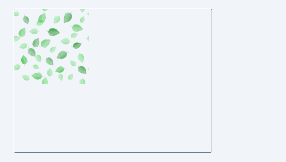
b. bg-repeat
Code Snippet
<div className="w-2/3 h-96 flex items-center border border-slate-500 rounded bg-repeat" style={{ backgroundImage: "url('/pattern.webp')" }}> ....</div>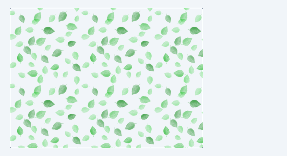
3. Background Position:
You can use background position to control the image's alignment and positioning, ensuring that it appears exactly where you want it to within the element, regardless of size differences between the image and the element.
Here are the Tailwind CSS classes for background position:
- bg-bottom: Positions the background image at the bottom of the element's content area.
- bg-center: Centers the background image both horizontally and vertically within the element's content area.
- bg-left: Positions the background image at the left edge of the element's content area.
- bg-left-bottom: Positions the background image at the left bottom corner of the element's content area.
- bg-left-top: Positions the background image at the left top corner of the element's content area.
- bg-right: Positions the background image at the right edge of the element's content area.
- bg-right-bottom: Positions the background image at the right bottom corner of the element's content area.
- bg-right-top: Positions the background image at the right top corner of the element's content area.
- bg-top: Positions the background image at the top of the element's content area.
Examples:
a. bg-left-bottom
Code Snippet
<div className="w-2/3 h-96 flex items-center border border-slate-500 rounded bg-no-repeat bg-left-bottom" style={{backgroundImage: "url('/pattern.webp')" }}>... </div>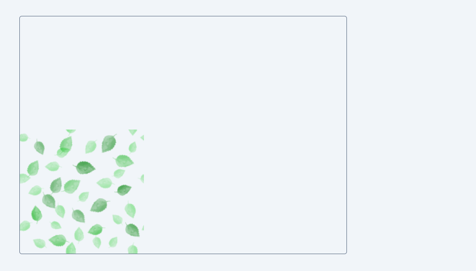
b. bg-center
Code Snippet
<div className="w-2/3 h-96 flex items-center border border-slate-500 rounded bg-no-repeat bg-center" style={{ backgroundImage: "url('/pattern.webp')" }}> ... </div>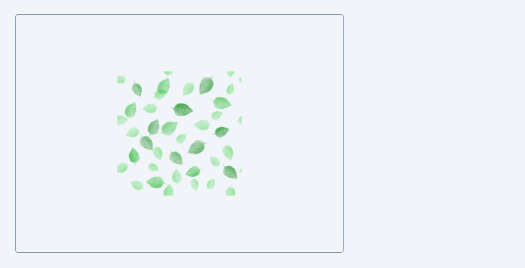
4. Background Origin
Background Origin is a CSS property that controls how an element's background image is positioned relative to its borders, padding, and content. It allows you to specify where the reference point for the background image should be within the element's box model, which consists of content, padding, and borders. Here's an explanation of the classes and their properties:
- bg-origin-border: This class sets the background origin to "border-box," which means that the background image's reference point is aligned with the outer edges of the element's border box. In other words, the background image is positioned relative to the outermost boundaries of the element, including its borders.
- bg-origin-padding: This class sets the background origin to "padding-box," which means that the background image's reference point is aligned with the inner edges of the element's padding box. It excludes the borders and positions the background image relative to the padded area inside the borders.
- bg-origin-content: This class sets the background origin to "content-box," which means that the background image's reference point is aligned with the innermost edges of the element's content box. It excludes both padding and borders, positioning the background image relative to the actual content area.
Examples:
a. bg-origin-border
Code Snippet
<div className="w-64 h-48 p-4 flex items-center border-8 border-slate-400 rounded bg-origin-border" style={{ backgroundImage: "url('/b2-image.webp')" }}>... </div>
a. bg-origin-padding
Code Snippet
<div className="w-64 h-48 p-4 flex items-center border-8 border-slate-400 rounded bg-origin-padding" style={{ backgroundImage: "url('/b2-image.webp')" }}>... </div>
In both cases, if you observe closely, certain portions of the image protrude beyond the element's borders when the bg-origin-border class is applied.
In this lesson, we've explored the application of background images in web design. Utilizing background images is a powerful technique that allows designers to elevate the visual appeal of their websites. By incorporating these images into the background of HTML elements, such as divs and sections, you can create captivating and engaging web designs, adding depth and character to the overall user experience.
In this lesson, we'll explore the exciting world of gradients and learn how to apply them to HTML elements using the flexibility and ease of Tailwind CSS classes. Gradients can add depth, richness, and creativity to your web designs, and by the end of this lesson, you'll have a solid understanding of how to use Tailwind classes to create stunning gradient effects on your web pages.
All Modules