✅ Now Live: Advanced Order Store for All Business Types – Rentals, Services, Subscriptions & More!✅ Now Live: Advanced Order Store for All Business Types – Rentals, Services, Subscriptions & More!✅ Now Live: Advanced Order Store for All Business Types – Rentals, Services, Subscriptions & More!✅ Now Live: Advanced Order Store for All Business Types – Rentals, Services, Subscriptions & More!✅ Now Live: Advanced Order Store for All Business Types – Rentals, Services, Subscriptions & More!✅ Now Live: Advanced Order Store for All Business Types – Rentals, Services, Subscriptions & More!✅ Now Live: Advanced Order Store for All Business Types – Rentals, Services, Subscriptions & More!✅ Now Live: Advanced Order Store for All Business Types – Rentals, Services, Subscriptions & More!✅ Now Live: Advanced Order Store for All Business Types – Rentals, Services, Subscriptions & More!✅ Now Live: Advanced Order Store for All Business Types – Rentals, Services, Subscriptions & More!
Sizing
Discover Tailwind CSS's sizing utilities to manage element dimensions in your web designs. Learn how to apply height and width classes for responsive, visually appealing layouts with precise control.
1. Width
In Tailwind CSS, the width utility classes are used to set the width of an HTML element. These classes provide a wide range of options for specifying the width of an element, from fixed pixel values to relative percentages and more.
The width utility classes follow a pattern of w-{value}, where {value} can be a specific width measurement or a keyword representing a sizing behavior. Here's an explanation of these classes:
- w-0: Sets the width to 0 pixels.
- w-px: Sets the width to 1 pixel.
- w-0.5 to w-64: Sets the width to values ranging from 2px to 256px.
- w-1/2 to w-11/12: Sets the width to fractions of the parent container's width, ranging from 50% to 91.67%.
- w-full: Sets the width to 100% of the parent container's width.
- w-screen, w-svw, w-lvw, w-dvw: Sets the width to the viewport width with various viewport-relative units (vw, svw, lvw, dvw - explained later in the lesson).
- w-min and w-max: Sets the width to the minimum or maximum content width, allowing the element to expand or shrink based on its content.
- w-fit: Sets the width to fit the content, expanding only as much as necessary to contain its content.
Example: Using Fixed Widths
Code Snippet
<div className='p-2 text-center bg-rose-400 rounded-sm w-80'>w-80 = 20rem</div> <div className='p-2 text-center bg-rose-400 rounded-sm w-72'>w-72 = 18rem</div> <div className='p-2 text-center bg-rose-400 rounded-sm w-60'>w-60 = 15rem</div> <div className='p-2 text-center bg-rose-400 rounded-sm w-52'>w-52 = 13rem</div>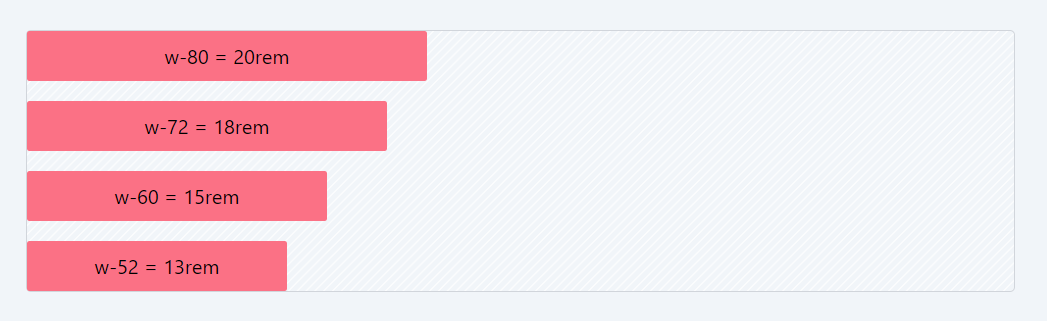
Example: Using Percentage Widths
Code Snippet
<div className='p-2 text-center bg-purple-400 rounded-sm w-full'>w-full</div> <div className='p-2 text-center bg-purple-400 rounded-sm w-9/12'>w-9/12</div> <div className='p-2 text-center bg-purple-400 rounded-sm w-2/5'>w-2/5</div> <div className='p-2 text-center bg-purple-400 rounded-sm w-1/4'>w-1/4</div>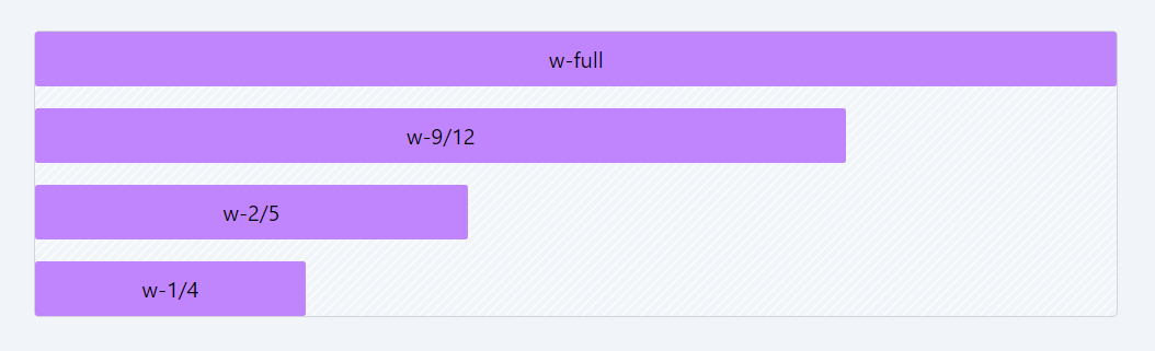
Viewport Relative Values
Viewport-relative values in CSS are used to specify sizes and dimensions relative to the viewport (the visible portion of the web page in the browser). They are helpful for creating responsive layouts that adapt to different screen sizes. Here's an explanation of the commonly used viewport-relative units:
- vw (Viewport Width): 1vw represents 1% of the viewport width.It allows you to size elements relative to the width of the viewport.For example, width: 50vw; would make an element take up half of the viewport's width.
- svw (Smallest Viewport Width): 1svw represents 1% of the smaller dimension between the viewport's width and height.It's particularly useful for ensuring elements are responsive regardless of whether the viewport is in landscape or portrait orientation.
- lvw (Largest Viewport Width): 1lvw represents 1% of the larger dimension between the viewport's width and height.Similar to svw, but it's based on the larger dimension. Useful when you want elements to adapt to the longer side of the viewport.
- dvw (Device Viewport Width): 1dvw represents 1% of the device's viewport width, which may differ from the CSS viewport width. It's less commonly used but can be helpful when you need to consider the physical dimensions of the device's screen.
These viewport-relative units are particularly valuable for creating responsive typography, layout sizing, and positioning, as they allow elements to adapt to the available screen space regardless of the device's size or orientation.
2. Height
In Tailwind CSS, the height utility classes are used to set the height of an HTML element. These classes provide a wide range of options for specifying the height of an element, from fixed pixel values to relative percentages and more.
The height utility classes follow a pattern of h-{value}, where {value} can be a specific height measurement or a keyword representing a sizing behavior. Here's an explanation of these classes:
- h-0: Sets the height to 0 pixels.
- h-px: Sets the height to 1 pixel.
- h-0.5 to h-64: Sets the height to values ranging from 2px to 256px.
- h-1/2 to h-5/6: Sets the height to fractions of the parent container's height, ranging from 50% to 83.33%.
- h-full: Sets the height to 100% of the parent container's height.
- h-screen, h-svh, h-lvh, h-dvh: Sets the height to the viewport height with various viewport-relative units (vh, svh, lvh, dvh).
- h-min and h-max: Sets the height to the minimum or maximum content height, allowing the element to expand or shrink based on its content.
- h-fit: Sets the height to fit the content, expanding only as much as necessary to contain its content.
Example: Using Fixed Heights
Code Snippet
<div className="flex items-end gap-4 bg-stripes rounded border border-gray-300"> <div className='p-2 text-center bg-cyan-400 rounded-sm h-80'>h-80</div> <div className='p-2 text-center bg-cyan-400 rounded-sm h-72'>h-72</div> <div className='p-2 text-center bg-cyan-400 rounded-sm h-60'>h-60</div> <div className='p-2 text-center bg-cyan-400 rounded-sm h-52'>h-52</div> </div>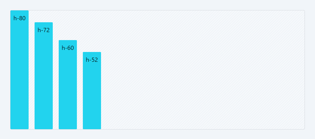
Example: Using Percentage Heights
Code Snippet
<div className="flex items-end gap-4 bg-stripes rounded border border-gray-300 h-80"> <div className='p-2 text-center bg-cyan-400 rounded-sm h-full'>h-full</div> <div className='p-2 text-center bg-cyan-400 rounded-sm h-4/5'>h-4/5</div> <div className='p-2 text-center bg-cyan-400 rounded-sm h-2/5'>h-2/5</div> <div className='p-2 text-center bg-cyan-400 rounded-sm h-1/4'>h-1/4</div> </div>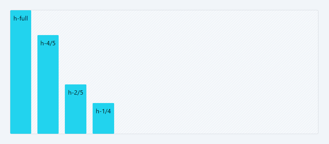
These classes provide flexibility in controlling the height of elements in your layout, making it easier to create responsive designs that adapt to different screen sizes and content lengths. You can choose the appropriate class based on your design requirements.
3. Size
In Tailwind CSS, the size utility classes are designed for setting both the width and height of an HTML element simultaneously. These classes provide a comprehensive set of options for specifying the size of an element, allowing you to control both its width and height in a single class.
The size utility classes follow a pattern of size-{value}, where {value} can be a specific size measurement or a keyword representing a sizing behavior. Here's an explanation of these classes:
- size-0: Sets both the width and height to 0 pixels.
- size-px: Sets both the width and height to 1 pixel.
- size-0.5 to size-64: Sets both the width and height to values ranging from 2px to 256px.
- size-1/2 to size-11/12: Sets both the width and height to fractions of the parent container's width and height, respectively, ranging from 50% to 91.67%.
- size-full: Sets both the width and height to 100% of the parent container's width and height.
- size-auto: Allows both the width and height to be automatically determined based on the element's content.
- size-min: Sets both the width and height to the minimum content size, allowing the element to shrink based on its content.
- size-max: Sets both the width and height to the maximum content size, allowing the element to expand based on its content.
- size-fit: Sets both the width and height to fit the content, expanding only as much as necessary to contain its content.
Example: Using Fixed Width and Heights
Code Snippet
<div className="flex items-end gap-4 bg-stripes rounded border border-gray-300"> <div className='p-2 text-center bg-cyan-400 rounded-sm size-40'>size-40</div> <div className='p-2 text-center bg-cyan-400 rounded-sm size-36'>size-36</div> <div className='p-2 text-center bg-cyan-400 rounded-sm size-32'>size-32</div> <div className='p-2 text-center bg-cyan-400 rounded-sm size-28'>size-28</div> </div>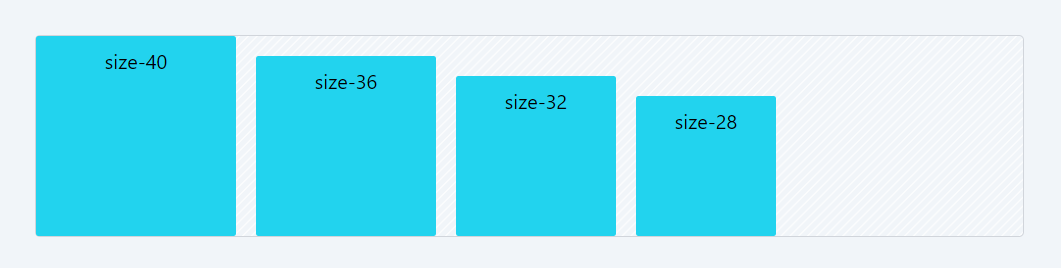
4. Min-Width
In Tailwind CSS, the min-width utility classes are used to set the minimum width of an HTML element. These classes provide precise control over the minimum width, allowing you to ensure that an element never becomes narrower than a specified size.
The min-width utility classes follow a pattern of min-w-{value}, where {value} can be a specific size measurement or a keyword representing a sizing behavior. Here's an explanation of these classes:
- min-w-0: Sets the minimum width to 0 pixels, allowing the element to become as narrow as possible.
- min-w-px: Sets the minimum width to 1 pixel, ensuring that the element is at least one pixel wide.
- min-w-0.5 to min-w-64: Sets the minimum width to values ranging from 2px to 256px, providing various minimum width options.
- min-w-1 to min-w-96: Sets the minimum width to values ranging from 4px to 384px, offering more control over minimum width.
- min-w-full: Sets the minimum width to 100% of the parent container's width, ensuring that the element is never narrower than its container.
- min-w-min: Sets the minimum width to the minimum content size, allowing the element to shrink based on its content but not narrower than its content.
- min-w-max: Sets the minimum width to the maximum content size, ensuring that the element is at least as wide as its maximum content.
- min-w-fit: Sets the minimum width to fit the content, expanding only as much as necessary to contain its content but not narrower than its content.
Code Snippet
<div className="flex items-start flex-col gap-4 bg-stripes rounded border border-gray-300"> <div className='p-2 text-center bg-cyan-400 rounded-sm min-w-72'>min-w-72</div> <div className='p-2 text-center bg-cyan-400 rounded-sm min-w-60'>min-w-60</div> <div className='p-2 text-center bg-cyan-400 rounded-sm min-w-fit'>min-w-fit</div> <div className='p-2 text-center bg-cyan-400 rounded-sm min-w-full'>min-w-full</div> </div>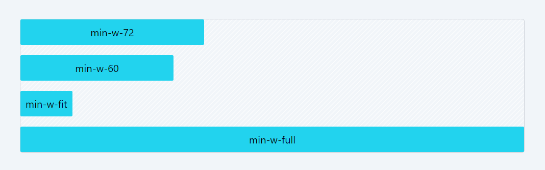
5. Max-Width
In Tailwind CSS, the max-width utility classes are used to set the maximum width of an HTML element. These classes provide control over how wide an element can be, ensuring that it doesn't exceed a specified maximum width.
The max-width utility classes follow a pattern of max-w-{value}, where {value} can be a specific size measurement, a responsive breakpoint, or a keyword representing a sizing behavior. Here's an explanation of these classes:
- max-w-0 to max-w-64: Sets the maximum width to values ranging from 0px to 256px, allowing you to cap the width of an element at various fixed sizes.
- max-w-none: Removes any maximum width constraint, allowing the element to expand freely.
- max-w-xs to max-w-7xl: Sets the maximum width to responsive breakpoint values, ensuring that the element's width changes based on the screen size.
- max-w-full: Sets the maximum width to 100% of the parent container's width, making the element as wide as its container.
- max-w-min: Sets the maximum width to the minimum content size, ensuring that the element doesn't exceed its content's width.
- max-w-max: Sets the maximum width to the maximum content size, capping the width at the maximum content width.
- max-w-fit: Sets the maximum width to fit the content, allowing the element to expand only as much as necessary to contain its content.
- max-w-prose: Sets the maximum width to a recommended line length for text content (approximately 65 characters).
- max-w-screen-sm to max-w-screen-2xl: Sets the maximum width based on responsive screen size breakpoints, making it suitable for creating responsive layouts.
Code Snippet
<div className="flex items-start flex-col gap-4 bg-stripes rounded border border-gray-300"> <div className='px-4 py-2 bg-cyan-300 rounded-sm max-w-52'>max-w-52: The snow-capped mountains cast a stunning shadow over the tranquil valley. </div> <div className='px-4 py-2 text-center bg-cyan-300 rounded-sm max-w-72'> max-w-72: The snow-capped mountains cast a stunning shadow over the tranquil valley. </div> <div className='px-4 py-2 text-center bg-cyan-300 rounded-sm max-w-96'> max-w-96: The snow-capped mountains cast a stunning shadow over the tranquil valley. </div> </div>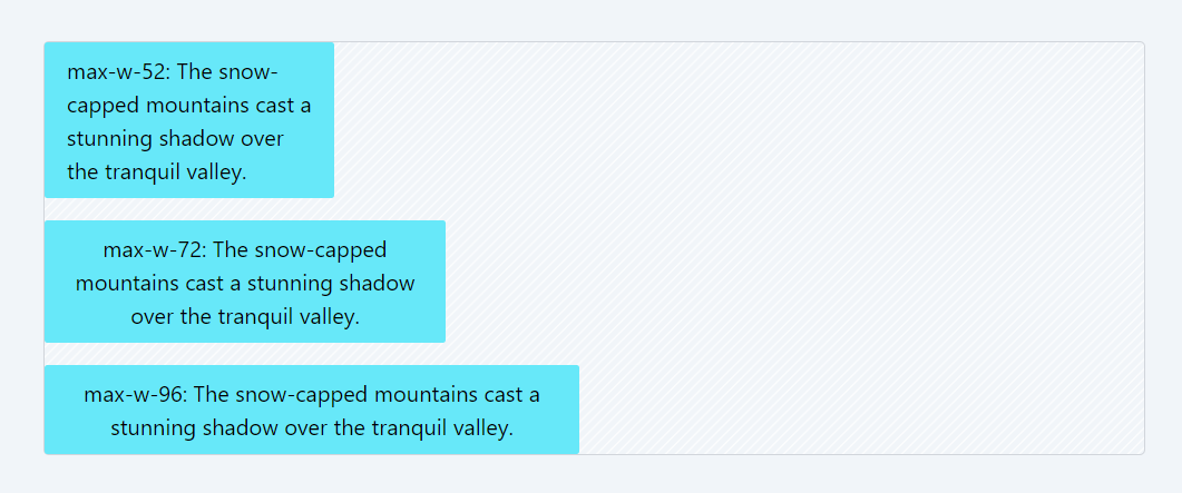
6. Min-Height
In Tailwind CSS, the min-height utility classes are designed to control the minimum height of HTML elements. These classes offer precise control over how tall an element should be, ensuring it never falls below a specified minimum height.
The min-height utility classes follow a consistent pattern of min-h-{value}, where {value} can represent different measurements, breakpoints for responsiveness, or keywords that define sizing behavior. Here's an explanation of these classes:
- min-h-0 to min-h-64: These classes set the minimum height to specific fixed values, ranging from 0px to 256px. They allow you to enforce a minimum height for elements at various predetermined sizes.
- min-h-px: This class sets the minimum height to an exact 1 pixel, offering ultra-fine control over element sizing.
- min-h-0.5: Establishes a minimum height of 0.125rem (2 pixels), providing a minimal but visible height for tiny elements that need a slight presence.
- min-h-1.5: Defines a minimum height of 0.375rem (6 pixels), offering a small but noticeable height for elements that require a bit more visibility.
- min-h-2.5: Sets a minimum height of 0.625rem (10 pixels), useful for elements that need slightly more vertical space while maintaining a compact size.
- min-h-3.5: Specifies a minimum height of 0.875rem (14 pixels), suitable for elements that require a bit more height than the smallest options.
- min-h-full: This class sets the minimum height to 100% of its parent container's height, making it adapt dynamically to its container's size.
- min-h-screen: Establishes a minimum height of 100vh (viewport height), ensuring the element takes up at least the full height of the viewport.
- min-h-svh: This class sets the minimum height to 100svh (scaled viewport height), allowing the element to adapt to a scaled viewport size.
- min-h-lvh: Defines a minimum height of 100lvh (logical viewport height), ensuring the element's height adapts to the logical viewport size.
- min-h-dvh: Sets the minimum height to 100dvh (dynamic viewport height), enabling the element to adjust to changes in the viewport height dynamically.
- min-h-min: This class sets the minimum height based on the content's minimum height, ensuring the element doesn't collapse smaller than its content.
- min-h-max: Establishes the minimum height based on the maximum content height, capping the minimum height at the maximum content height.
- min-h-fit: Sets the minimum height to fit the content, allowing the element to expand just enough to contain its content without unnecessary extra space.
Code Snippet
<div className="flex items-end gap-4 bg-stripes rounded border border-gray-300 h-80"> <div className='p-2 text-center bg-cyan-300 rounded-sm min-h-full'>min-h-full</div> <div className='p-2 text-center bg-cyan-300 rounded-sm min-h-72'>min-h-72</div> <div className='p-2 text-center bg-cyan-300 rounded-sm min-h-60'>min-h-60</div> <div className='p-2 text-center bg-cyan-300 rounded-sm min-h-52'>min-h-52</div> </div>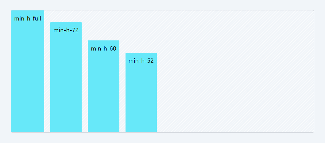
7. Max-Height
Tailwind CSS offers a range of utility classes to manage the maximum height of HTML elements, allowing precise control over how tall an element can be. These classes follow a pattern of max-h-{value}, where {value} can be a specific size, a pixel measurement, or a sizing behavior keyword. Here's an overview of these classes:
- max-h-0 to max-h-64: These classes set the maximum height from 0px to 256px, providing a selection of predefined heights for compact elements.
- max-h-px: Establishes a maximum height of 1px, suitable for ultra-thin horizontal dividers.
- max-h-0.5 to max-h-3.5: These classes offer minimal but visible maximum heights, ranging from 0.125rem (2 pixels) to 0.875rem (14 pixels), ideal for tiny elements that require slight vertical presence.
- max-h-4 to max-h-64: Extending the range, these classes set maximum heights from 1rem (16 pixels) to 16rem (256 pixels), offering a spectrum of predefined heights for various UI components.
- max-h-none: Removes any maximum height limitation, allowing elements to expand freely in height.
- max-h-full: Sets the maximum height to 100% of the parent container's height, making the element as tall as its container.
- max-h-screen, max-h-svh, max-h-lvh, max-h-dvh: These classes establish maximum heights based on viewport units, ensuring elements adapt to different screen and viewport sizes.
- max-h-min: Defines the maximum height based on the element's minimum content size, preventing it from exceeding its content's height.
- max-h-max: Caps the maximum height at the element's maximum content size, limiting the height based on the content.
- max-h-fit: Adapts the maximum height to fit the content, allowing elements to expand only as much as needed to contain their content.
Example:
In the code below, we've applied "h-full" classes to make the div's height equal to that of the container. However, the heights are restricted due to the "max-width" classes applied.
Code Snippet
<div className="flex items-end gap-4 bg-stripes rounded border border-gray-300 h-80"> <div className='p-2 text-center bg-purple-300 rounded-sm h-full max-h-full'>max-h-full</div> <div className='p-2 text-center bg-purple-300 rounded-sm h-full max-h-72'>max-h-72</div> <div className='p-2 text-center bg-purple-300 rounded-sm h-full max-h-60'>max-h-60</div> <div className='p-2 text-center bg-purple-300 rounded-sm h-full max-h-52'>max-h-52</div> </div>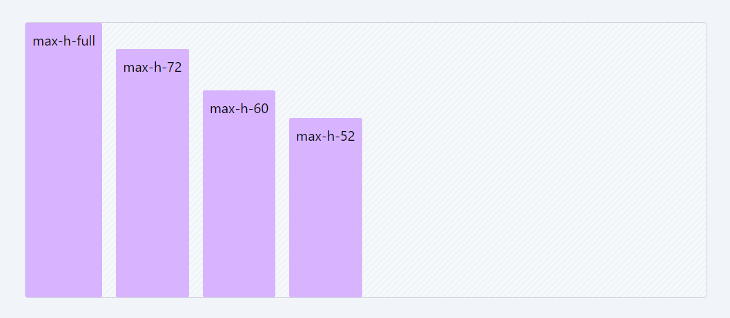
In this lesson, we explored Tailwind CSS sizing classes, versatile tools for precisely adjusting the dimensions of HTML elements. We examined classes for adjusting both width and height, offering a diverse range of options to accommodate different design requirements.
Learn how to make images and videos adapt to different screens and devices for seamless display. Master responsive media techniques for optimal user experience in diverse viewing contexts.
All Modules