✅ Now Live: Advanced Order Store for All Business Types – Rentals, Services, Subscriptions & More!✅ Now Live: Advanced Order Store for All Business Types – Rentals, Services, Subscriptions & More!✅ Now Live: Advanced Order Store for All Business Types – Rentals, Services, Subscriptions & More!✅ Now Live: Advanced Order Store for All Business Types – Rentals, Services, Subscriptions & More!✅ Now Live: Advanced Order Store for All Business Types – Rentals, Services, Subscriptions & More!✅ Now Live: Advanced Order Store for All Business Types – Rentals, Services, Subscriptions & More!✅ Now Live: Advanced Order Store for All Business Types – Rentals, Services, Subscriptions & More!✅ Now Live: Advanced Order Store for All Business Types – Rentals, Services, Subscriptions & More!✅ Now Live: Advanced Order Store for All Business Types – Rentals, Services, Subscriptions & More!✅ Now Live: Advanced Order Store for All Business Types – Rentals, Services, Subscriptions & More!
Aligning CSS Grid Items
In this lesson, we will delve into the diverse methods of aligning grid items within a CSS Grid layout. We will investigate how to employ CSS classes such as justify-items, align-items, align-content, justify-self, and align-self to precisely manage the placement of grid items, whether at the container level or on an individual basis within grid cells.
Let's examine the various CSS Grid classes that control the alignment of grid items, including justify-items, align-items, align-content, justify-self, and align-self.
1. justify-items
The justify-items property controls how grid items are aligned along their inline axis, which is the horizontal axis for most Western languages (left to right). Here's an explanation of each class:
Note that the default value of the justify-items property in CSS Grid is stretch. When no justify-items property is specified, or when it is set to stretch, grid items will be stretched to fill the entire width of their grid cell along the inline axis (horizontal axis in most Western languages, left to right).
This means that grid items will take up the full width of their cell, aligning with both the start and end edges of the cell horizontally.
- justify-items-stretch: This class stretches grid items along their inline axis to fill the entire width of their grid cell. This is the default behavior if no justify-items property is specified.
- justify-items-start: This class aligns grid items along their inline axis to the start of their grid cell. In a left-to-right writing mode, this means that items will be left-aligned within their cell.
- justify-items-end: This class aligns grid items along their inline axis to the end of their grid cell. In a left-to-right writing mode, this means that items will be right-aligned within their cell.
- justify-items-center: This class centers grid items along their inline axis within their grid cell. It horizontally centers the items.
Example: justify-items-stretch
Code Snippet
<div className="grid grid-cols-5 justify-items-stretch gap-4 border border-gray-600 bg-stripes rounded"> <div className='p-4 bg-cyan-300 rounded-sm'>Grid Item 1</div> <div className='p-4 bg-cyan-300 rounded-sm ' >Grid Item 2</div> <div className='p-4 bg-cyan-300 rounded-sm '>Grid Item 3</div> <div className='p-4 bg-cyan-300 rounded-sm '>Grid Item 4</div> <div className='p-4 bg-cyan-300 rounded-sm '>Grid Item 5</div> </div>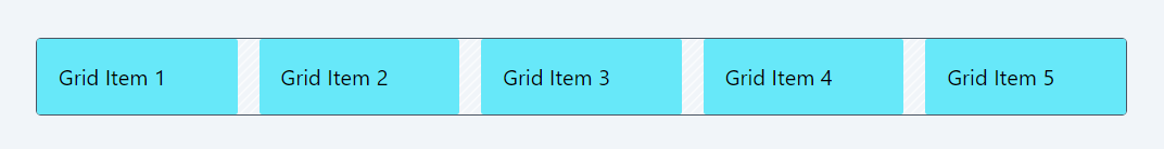
Example: justify-items-center
Code Snippet
<div className="grid grid-cols-5 justify-items-center border border-gray-600 bg-stripes rounded"> <div className='p-4 bg-cyan-300 rounded-sm'>Grid Item 1</div> <div className='p-4 bg-cyan-300 rounded-sm ' >Grid Item 2</div> <div className='p-4 bg-cyan-300 rounded-sm '>Grid Item 3</div> <div className='p-4 bg-cyan-300 rounded-sm '>Grid Item 4</div> <div className='p-4 bg-cyan-300 rounded-sm '>Grid Item 5</div> </div>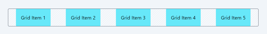
2. align-items
The align-items classes in Tailwind CSS are used to align grid items vertically within a container. These alignment classes become particularly useful when you have items with varying heights within the same container.
- items-start: Aligns items to the start of the cross axis.
- items-end: Aligns items to the end of the cross axis.
- items-center: Centers items along the cross axis.
- items-baseline: Aligns items along their baselines.
- items-stretch: Stretches items to fill the container (default behavior if no align-items class is specified).
These classes are key for controlling the vertical alignment of items within a grid container, especially useful in responsive layouts.
Example: items-start:
Code Snippet
<div className="grid grid-cols-5 items-start gap-4 border border-gray-600 bg-stripes rounded"> <div className='p-4 bg-cyan-300 rounded-sm'>Grid Item 1</div> <div className='p-4 bg-purple-300 rounded-sm ' >Grid Item 2 with large content</div> <div className='p-4 bg-cyan-300 rounded-sm '>Grid Item 3</div> <div className='p-4 bg-cyan-300 rounded-sm '>Grid Item 4</div> <div className='p-4 bg-cyan-300 rounded-sm '>Grid Item 5</div> </div>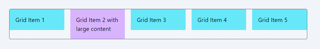
Example: items-center:
Code Snippet
<div className="grid grid-cols-5 items-center gap-4 border border-gray-600 bg-stripes rounded"> <div className='p-4 bg-cyan-300 rounded-sm'>Grid Item 1</div> <div className='p-4 bg-purple-300 rounded-sm ' >Grid Item 2 with large content</div> <div className='p-4 bg-cyan-300 rounded-sm '>Grid Item 3</div> <div className='p-4 bg-cyan-300 rounded-sm '>Grid Item 4</div> <div className='p-4 bg-cyan-300 rounded-sm '>Grid Item 5</div> </div>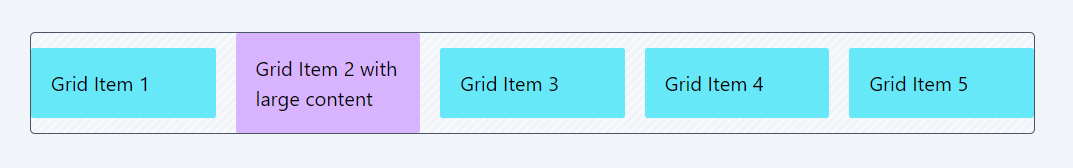
3. align-content:
The align-content property in CSS Grid controls the alignment of grid tracks (both rows and columns) along the cross-axis when there is extra space within the grid container. This property becomes meaningful when you have a grid with specified row and column tracks and there is extra space along the cross-axis due to differences in the sizes of grid items or gaps.
Here are the values for align-content in CSS Grid:
- content-normal: The normal value for align-content allows the browser to use its default behavior for alignment. It typically means that the tracks will be stretched to fill the available space along the cross-axis, similar to content-stretch.
- content-center: This class aligns the grid tracks along the cross-axis to the center of the grid container. It centers the tracks within the available space along the cross-axis.
- content-start: Aligns the grid tracks to the start of the cross-axis within the grid container. If there's extra space along the cross-axis, it will be added below the tracks.
- content-end: Aligns the grid tracks to the end of the cross-axis within the grid container. If there's extra space along the cross-axis, it will be added above the tracks.
- content-between: Distributes the grid tracks evenly along the cross-axis, with the first track aligned to the start of the container and the last track aligned to the end of the container. Extra space, if any, is distributed between the tracks.
- content-around: Distributes the grid tracks with equal space around each track along the cross-axis. Extra space, if any, is evenly distributed around all tracks.
- content-evenly: Distributes the grid tracks with equal space between them along the cross-axis. Extra space, if any, is evenly distributed between and around all tracks.
- content-baseline: Aligns the grid tracks along their baselines. This is useful when you have text or elements with different font sizes, and you want to align them based on their text baselines.
- content-stretch: Stretches the grid tracks to fill the entire available space along the cross-axis. This is the default behavior if no align-content property is specified, and it ensures that tracks occupy the full height of the container.
These values control how the grid tracks are aligned along the cross-axis when there is extra space within the grid container. This can be especially useful in responsive layouts or when dealing with grids where the grid items have varying heights or gaps between them.
Example: content-start:
Code Snippet
<div className="grid grid-cols-5 content-start gap-4 border border-gray-600 bg-stripes rounded h-56"> <div className='p-4 bg-cyan-300 rounded-sm'>Grid Item 1</div> <div className='p-4 bg-cyan-300 rounded-sm'>Grid Item 2</div> <div className='p-4 bg-cyan-300 rounded-sm'>Grid Item 3</div> <div className='p-4 bg-cyan-300 rounded-sm'>Grid Item 4</div> <div className='p-4 bg-cyan-300 rounded-sm'>Grid Item 5</div> </div>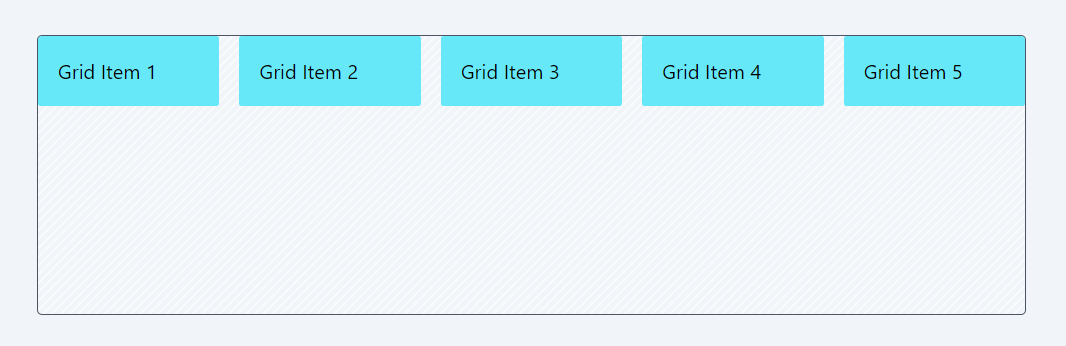
Example: content-center:
Code Snippet
<div className="grid grid-cols-5 content-center gap-4 border border-gray-600 bg-stripes rounded h-56"> <div className='p-4 bg-cyan-300 rounded-sm'>Grid Item 1</div> <div className='p-4 bg-cyan-300 rounded-sm' >Grid Item 2</div> <div className='p-4 bg-cyan-300 rounded-sm'>Grid Item 3</div> <div className='p-4 bg-cyan-300 rounded-sm'>Grid Item 4</div> <div className='p-4 bg-cyan-300 rounded-sm'>Grid Item 5</div> </div>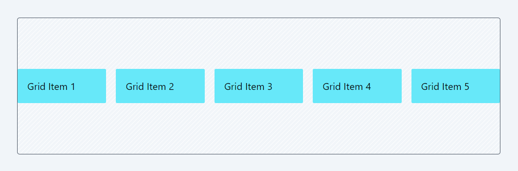
4. Justify-Self:
In addition to justify-items, align-items, and align-content, which are applied at the grid container level to control the alignment of grid items within the entire grid, individual grid items can be positioned using the justify-self and align-self classes. Let's explore these classes now.
The justify-self classes allow you to control the horizontal alignment of individual grid items within their respective grid cells. Here's an explanation of each class:
- justify-self-auto: This class sets the justify-self property to auto. When applied to a specific grid item, it allows the item to inherit its horizontal alignment from the grid container's justify-items property. In other words, the item will be aligned according to the justify-items value of its parent grid.
- justify-self-start: When applied to a specific grid item, this class aligns the item to the start of its grid cell along the horizontal axis (typically left-aligned in a left-to-right writing mode).
- justify-self-end: When applied to a specific grid item, this class aligns the item to the end of its grid cell along the horizontal axis (typically right-aligned in a left-to-right writing mode).
- justify-self-center: When applied to a specific grid item, this class horizontally centers the item within its grid cell.
- justify-self-stretch: When applied to a specific grid item, this class stretches the item horizontally to fill its entire grid cell. It ensures that the item occupies the full available width within its cell.
Example: justify-self-start:
Code Snippet
<div className="grid grid-cols-5 border border-gray-600 bg-stripes bg-red-300 rounded overflow-hidden"> <div className='p-4 bg-cyan-300 rounded-sm '>Grid Item 1</div> <div className='p-4 bg-red-300 rounded-sm justify-self-start'>Grid Item 2</div> <div className='p-4 bg-cyan-300 rounded-sm'>Grid Item 3</div> <div className='p-4 bg-cyan-300 rounded-sm'>Grid Item 4</div> <div className='p-4 bg-cyan-300 rounded-sm'>Grid Item 5</div> </div>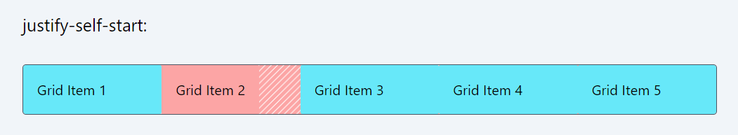
Example: justify-self-center:
Code Snippet
<div className="grid grid-cols-5 border border-gray-600 bg-stripes bg-red-300 rounded overflow-hidden"> <div className='p-4 bg-cyan-300 rounded-sm '>Grid Item 1</div> <div className='p-4 bg-red-300 rounded-sm justify-self-center'>Grid Item 2</div> <div className='p-4 bg-cyan-300 rounded-sm'>Grid Item 3</div> <div className='p-4 bg-cyan-300 rounded-sm'>Grid Item 4</div> <div className='p-4 bg-cyan-300 rounded-sm'>Grid Item 5</div> </div>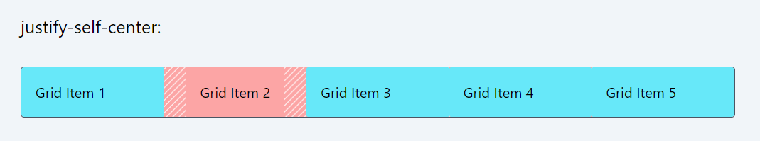
5. align-Self:
The align-self classes allow you to control the vertical alignment of individual flex items within a flex container. Here's an explanation of each class:
- self-auto: When applied to a specific flex item, this class allows the item to inherit its vertical alignment from the flex container's align-items property. In other words, the item will be vertically aligned according to the align-items value of its parent flex container.
- self-start: When applied to a specific flex item, this class aligns the item to the start of the cross-axis within its flex container. In a row-oriented container, this means the item will be aligned to the top vertically. In a column-oriented container, it aligns the item to the beginning along the main axis.
- self-end: When applied to a specific flex item, this class aligns the item to the end of the cross-axis within its flex container. In a row-oriented container, this means the item will be aligned to the bottom vertically. In a column-oriented container, it aligns the item to the end along the main axis.
- self-center: When applied to a specific flex item, this class vertically centers the item within its flex container along the cross-axis. It ensures that the item is centered vertically.
- self-stretch: When applied to a specific flex item, this class stretches the item vertically to fill the entire available space along the cross-axis within its flex container. It ensures that the item occupies the full height of its container.
- self-baseline: When applied to a specific flex item, this class aligns the item along its baseline. It's particularly useful when dealing with text elements of varying font sizes, as it aligns items based on their text baselines.
Example: self-start:
In this example, the first item contains more content, making it larger than the others. All items except for the second one are stretched vertically to fill the available space within their respective grid cells. However, for item 2, the self-start class is applied, which aligns it to the top of its grid cell.
Code Snippet
<div className="grid grid-cols-5 border border-gray-600 bg-stripes bg-red-300 rounded overflow-hidden"> <div className='p-4 bg-cyan-300 rounded-sm '>Grid Item 1 with large content</div> <div className='p-4 bg-red-300 rounded-sm self-start'>Grid Item 2</div> <div className='p-4 bg-cyan-300 rounded-sm'>Grid Item 3</div> <div className='p-4 bg-cyan-300 rounded-sm'>Grid Item 4</div> <div className='p-4 bg-cyan-300 rounded-sm'>Grid Item 5</div> </div>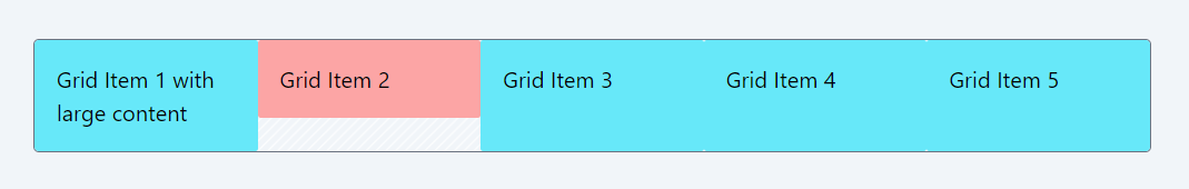
Example: self-center:
In this example, the first item contains more content, making it larger than the others. All items except for the second one are stretched vertically to fill the available space within their respective grid cells. However, for item 2, the self-start class is applied, which aligns it to the top of its grid cell.
Code Snippet
<div className="grid grid-cols-5 border border-gray-500 bg-stripes rounded overflow-hidden"> <div className='p-4 bg-cyan-300 rounded-sm '>Grid Item 1 with large content</div> <div className='p-4 bg-red-300 rounded-sm self-center'>Grid Item 2</div> <div className='p-4 bg-cyan-300 rounded-sm'>Grid Item 3</div> <div className='p-4 bg-cyan-300 rounded-sm'>Grid Item 4</div> <div className='p-4 bg-cyan-300 rounded-sm'>Grid Item 5</div> </div>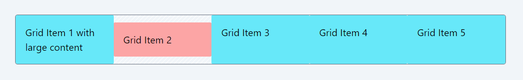
In this lesson, let's explore some questions that will help you solidify your understanding of CSS Grid.
All Modules